Designing clear, brand-aligned graphics for a data-rich study
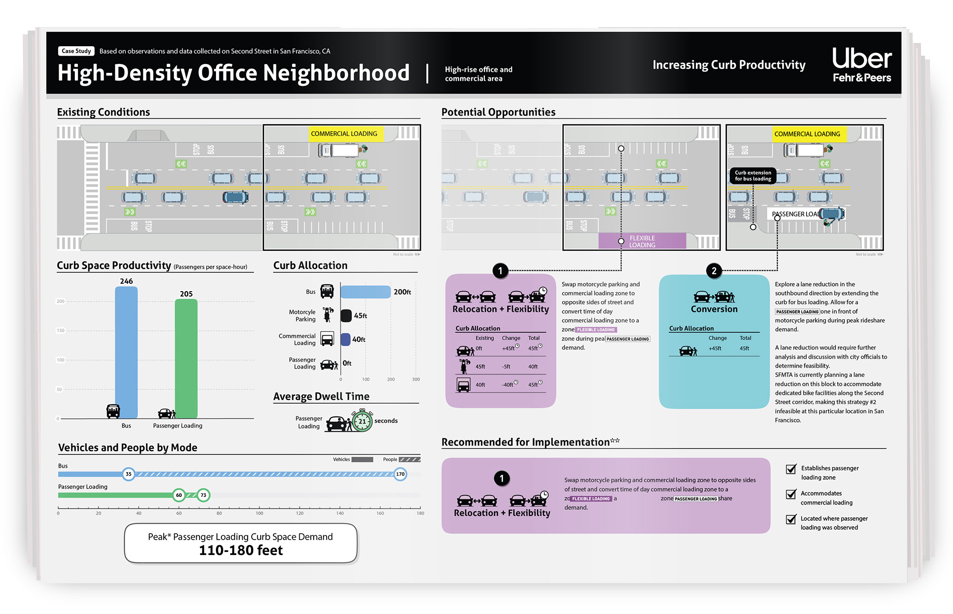
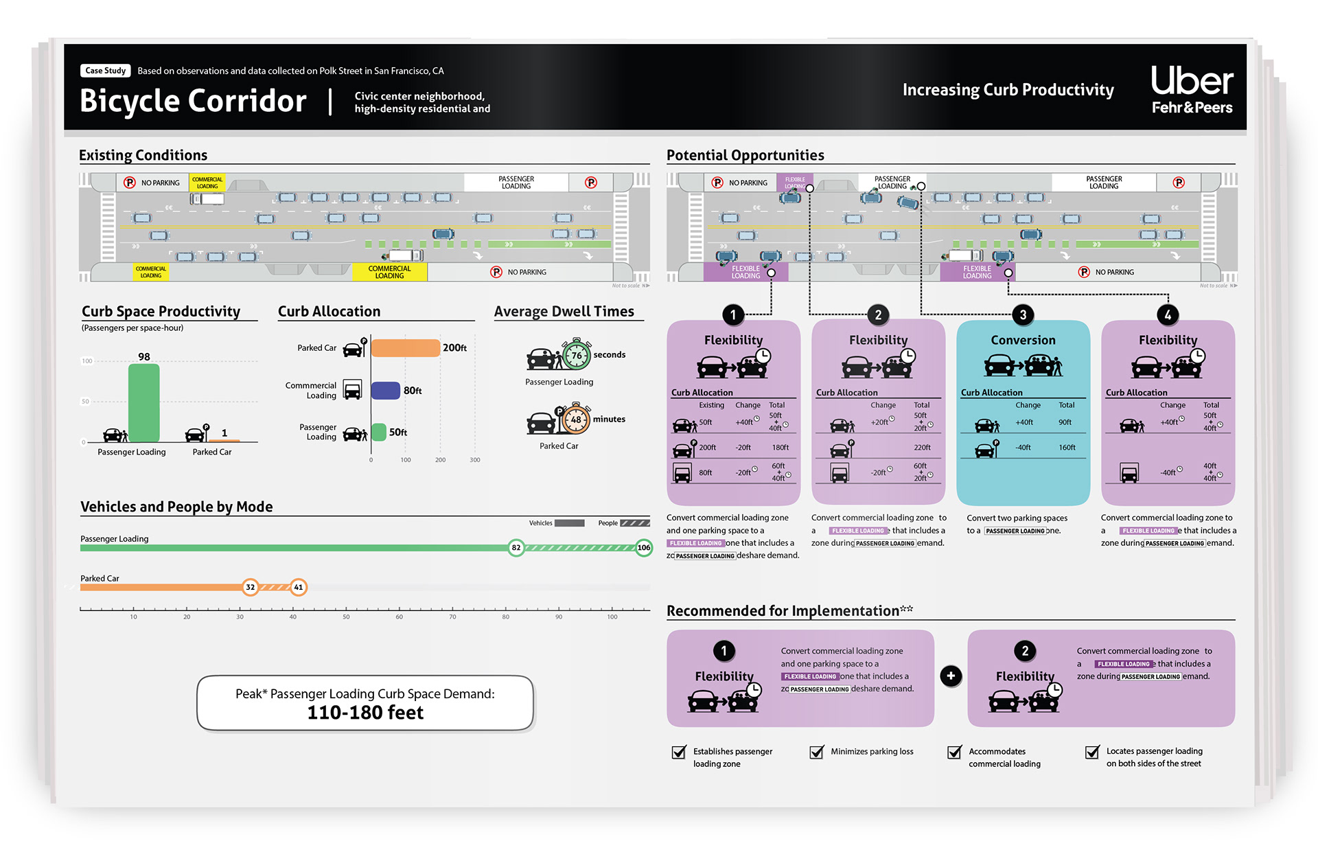
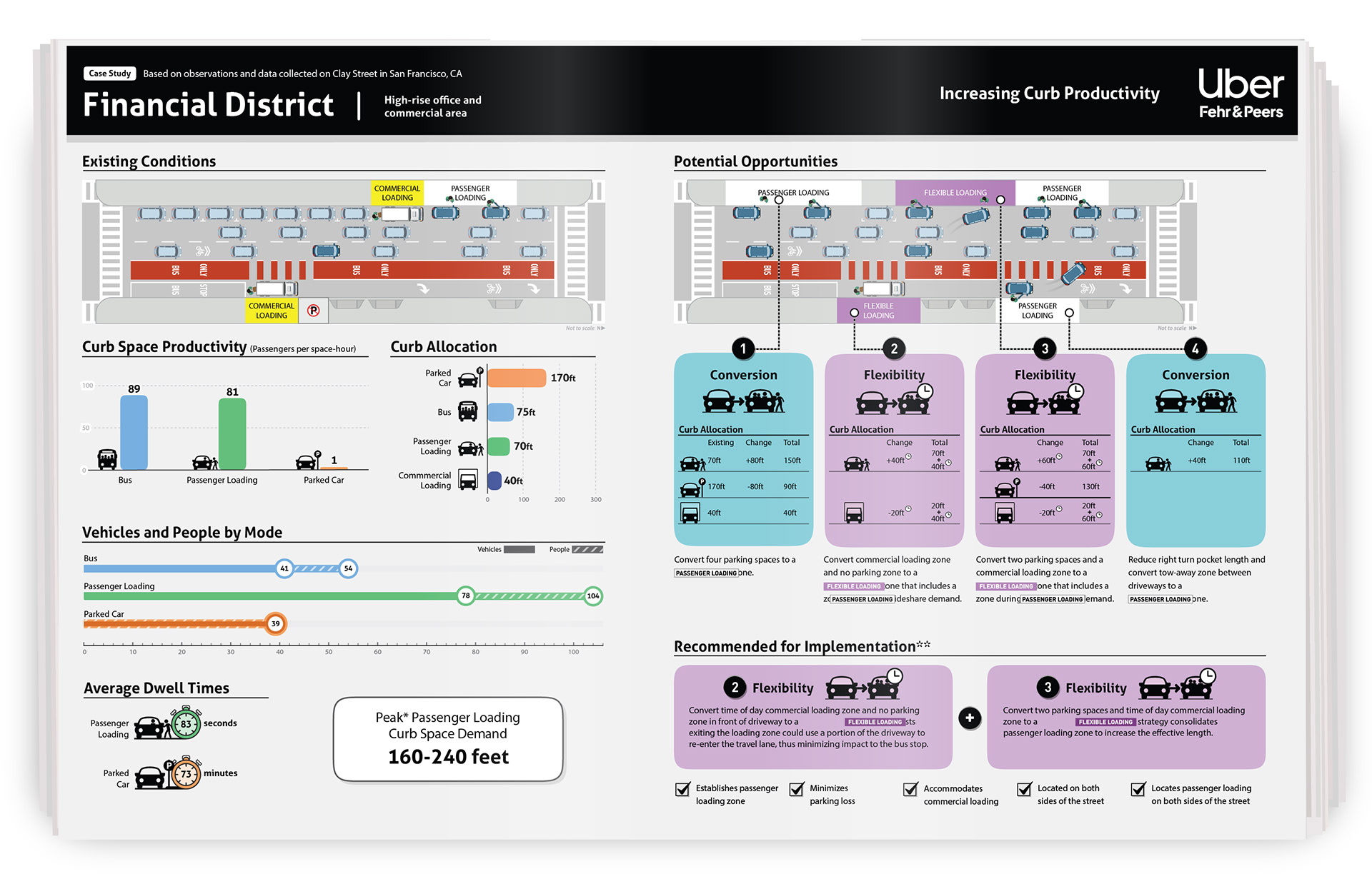
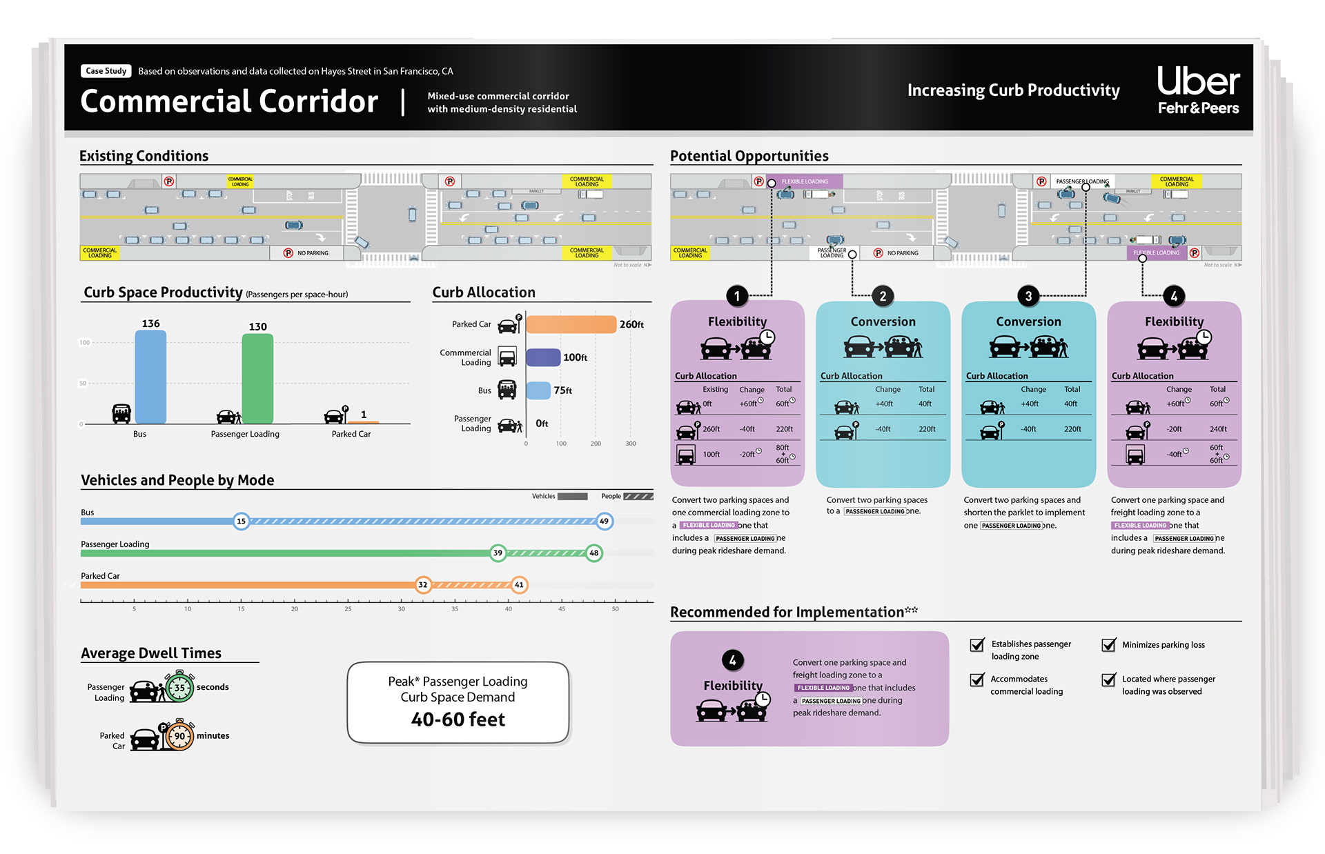
Uber commissioned our team to analyze rideshare activity, traffic counts, and observational data across different urban environments. I worked closely with data scientists to translate those findings into clear, actionable graphics while staying within Uber’s established visual language.

Building a Scalable Visual System
I developed the visual style for the study, creating a modular system of custom icons, simplified spatial diagrams, and time-based graphics. These elements turned complex real-world behaviors into consistent visual patterns that could be quickly understood and reused across multiple scenarios.
The challenge was balancing clarity with brand consistency. Each graphic needed to communicate detailed findings while still feeling unmistakably aligned with Uber’s identity.

Turning Data into Decisions
The final graphics were designed as decision-making tools, helping stakeholders compare conditions, understand tradeoffs, and identify appropriate strategies. Rather than simply visualizing data, the system made complex findings easier to interpret and apply.