Designing an identity and publication system for a regional transportation strategy
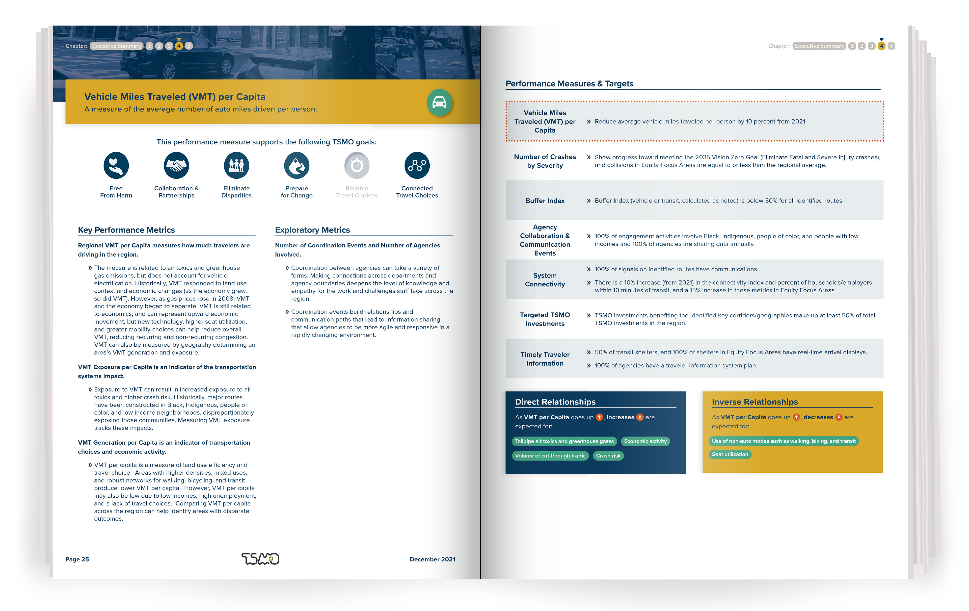
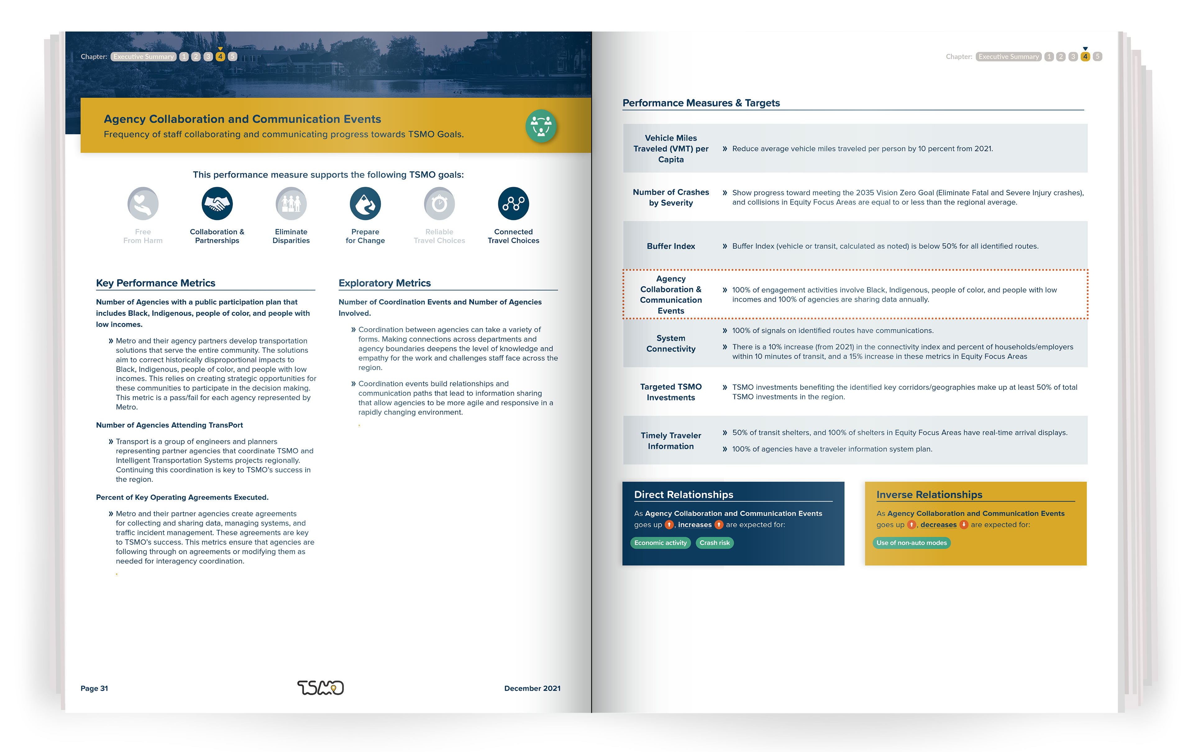
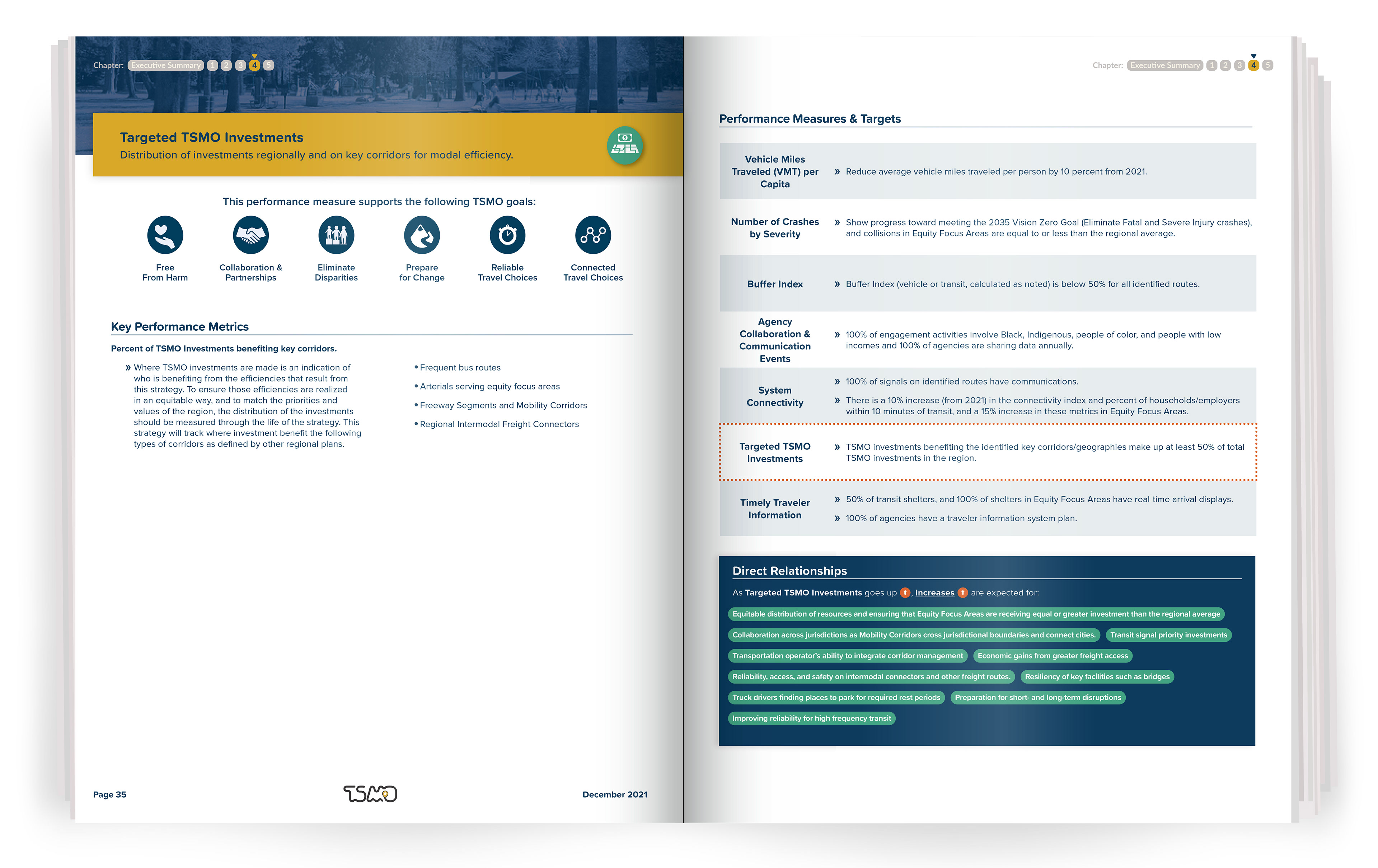
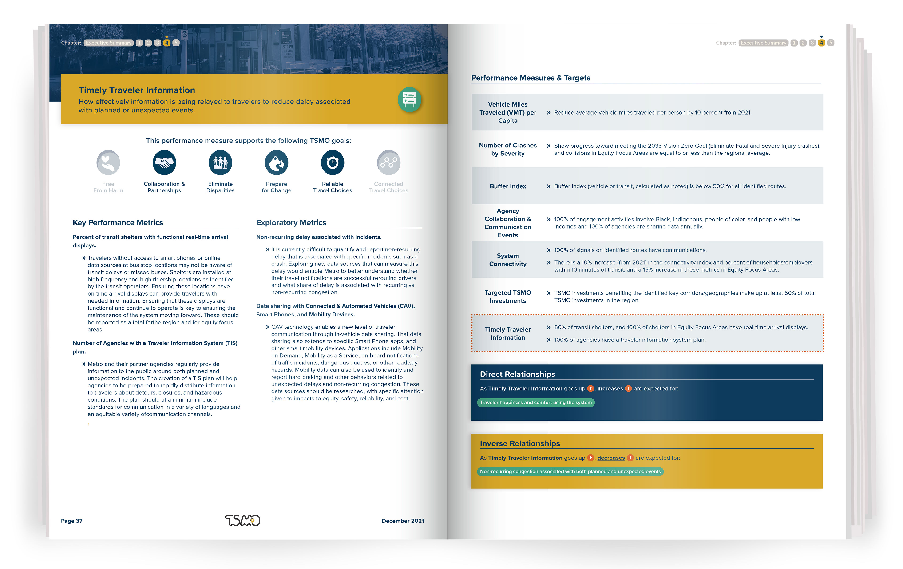
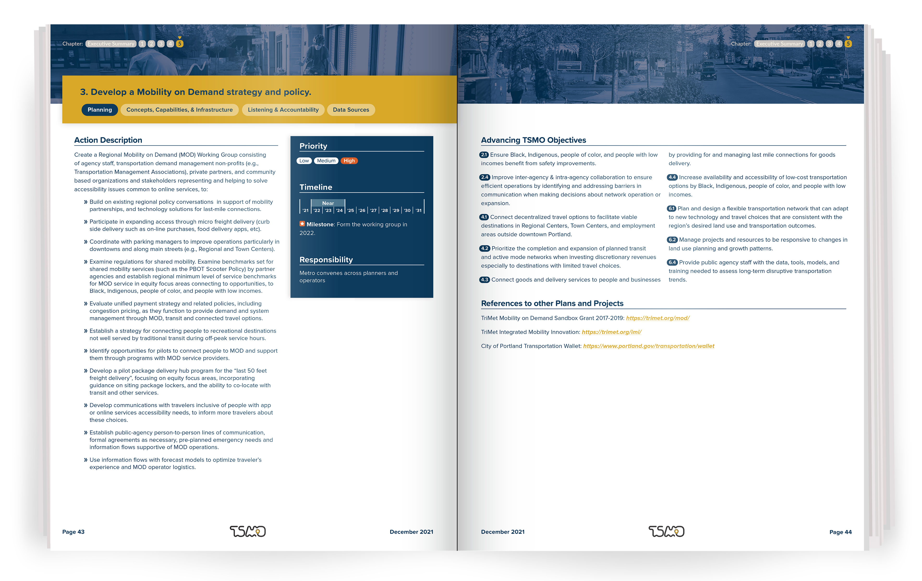
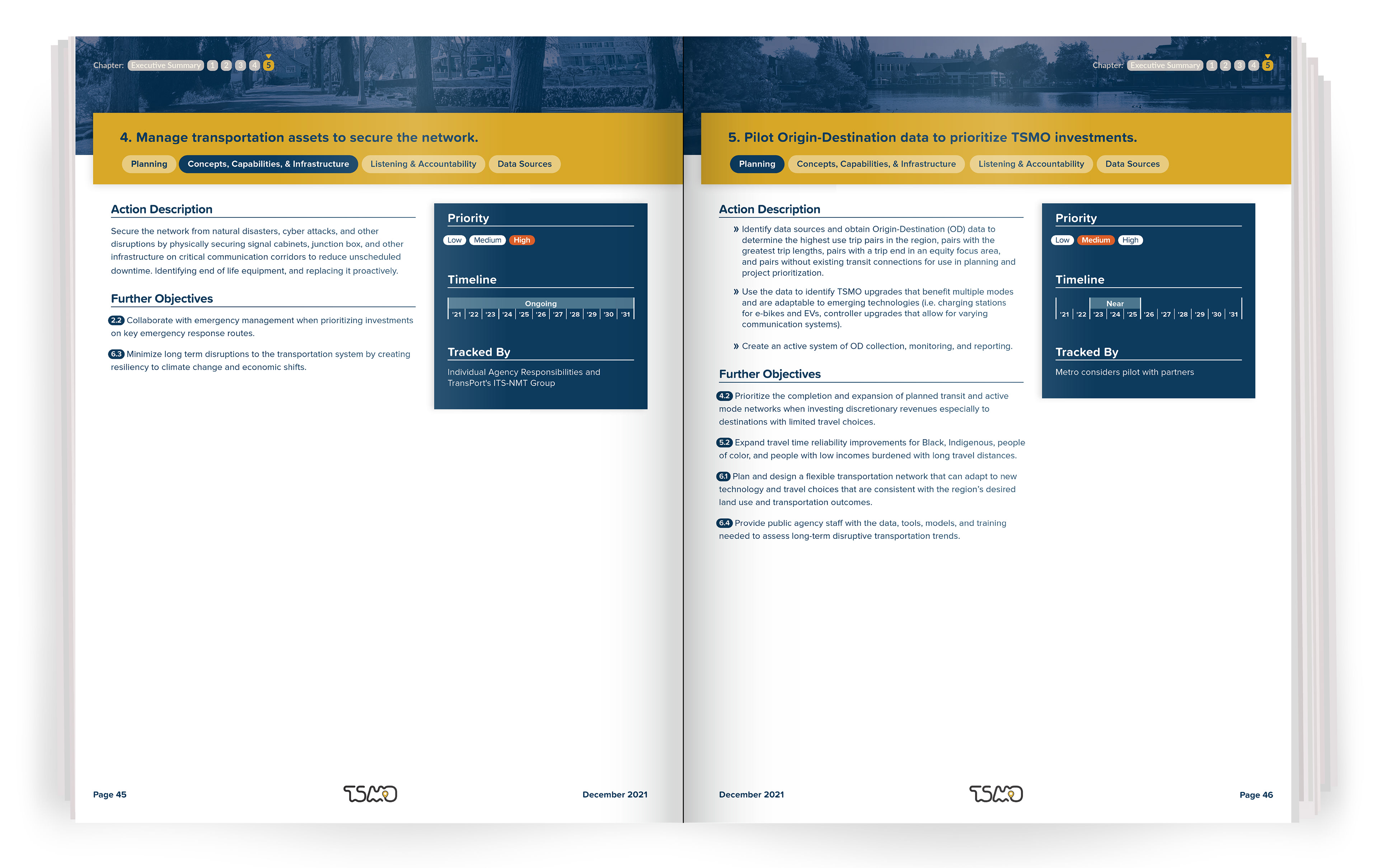
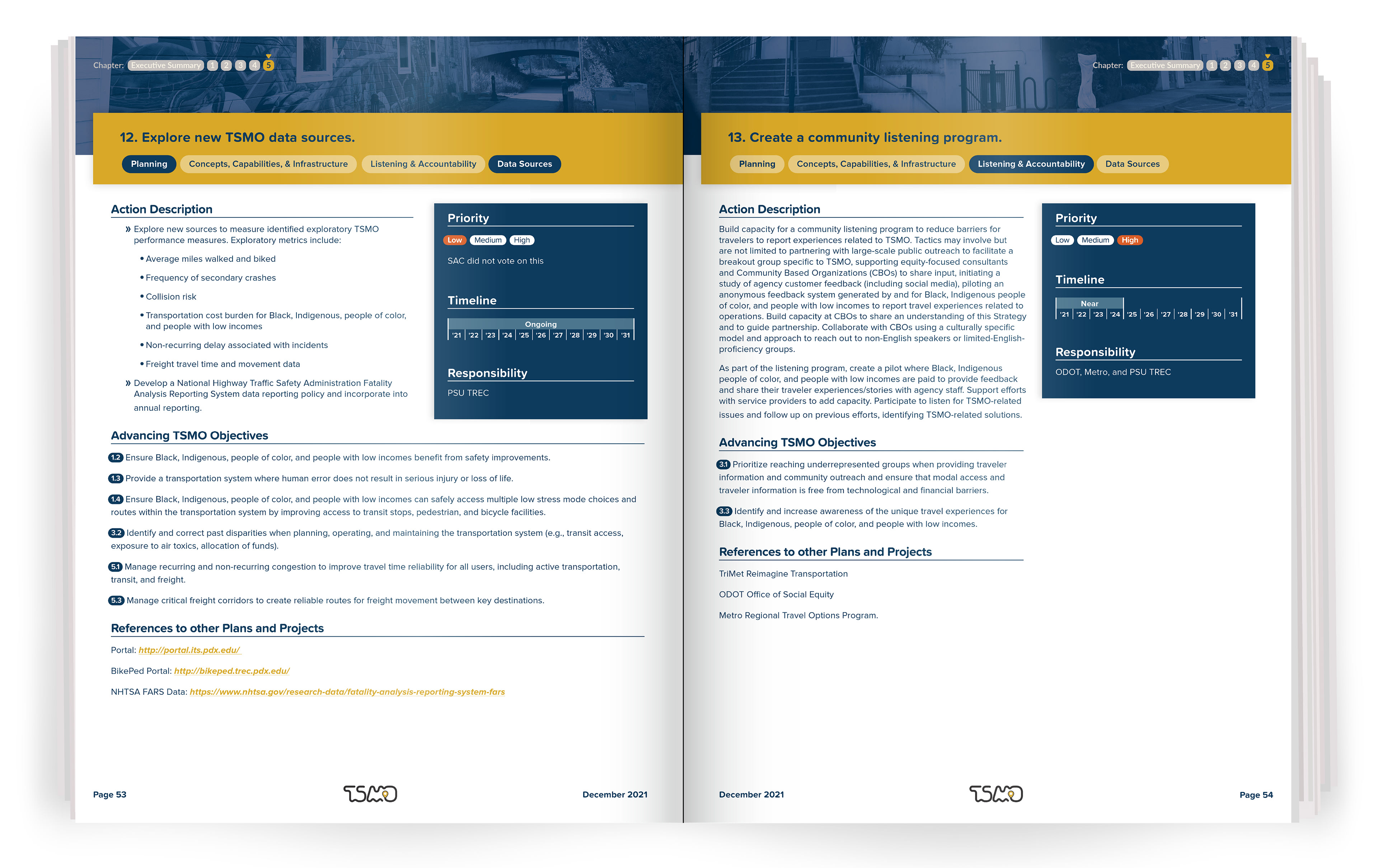
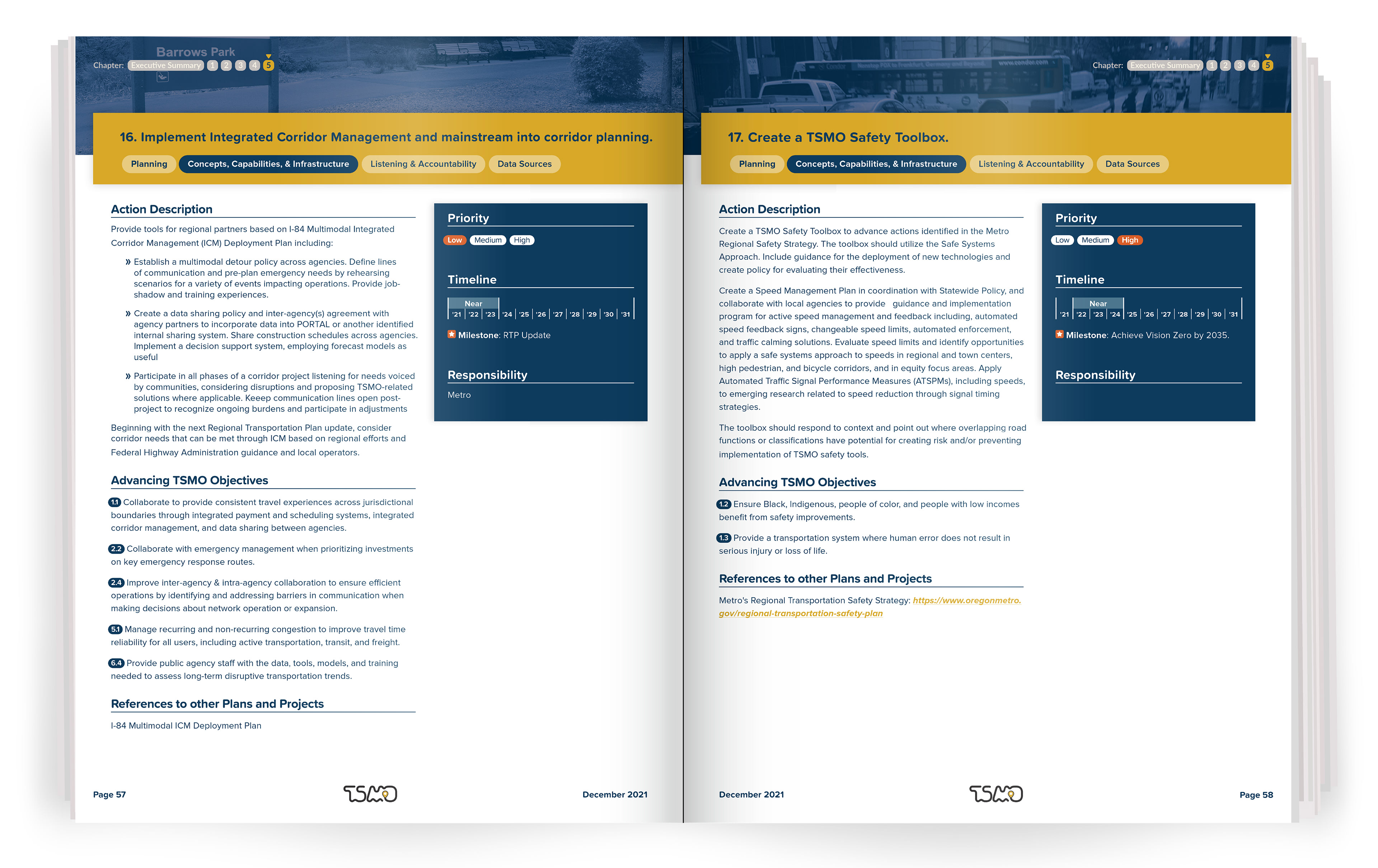
Oregon Metro’s regional TSMO strategy brought together policy, planning, equity, and technical guidance in a single long-format publication. My role was to transform that complexity into a clear, cohesive, and engaging experience from beginning to end.
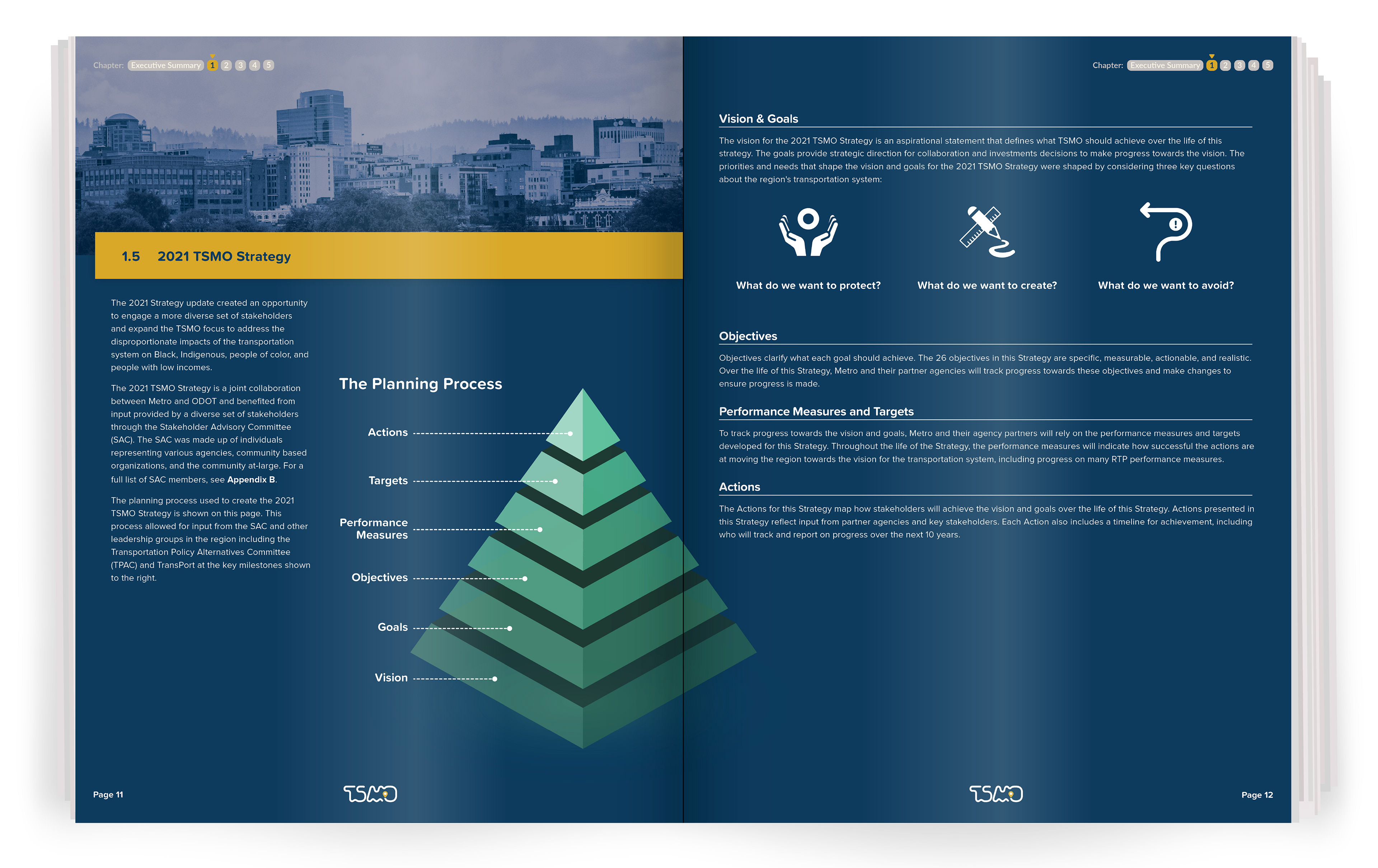
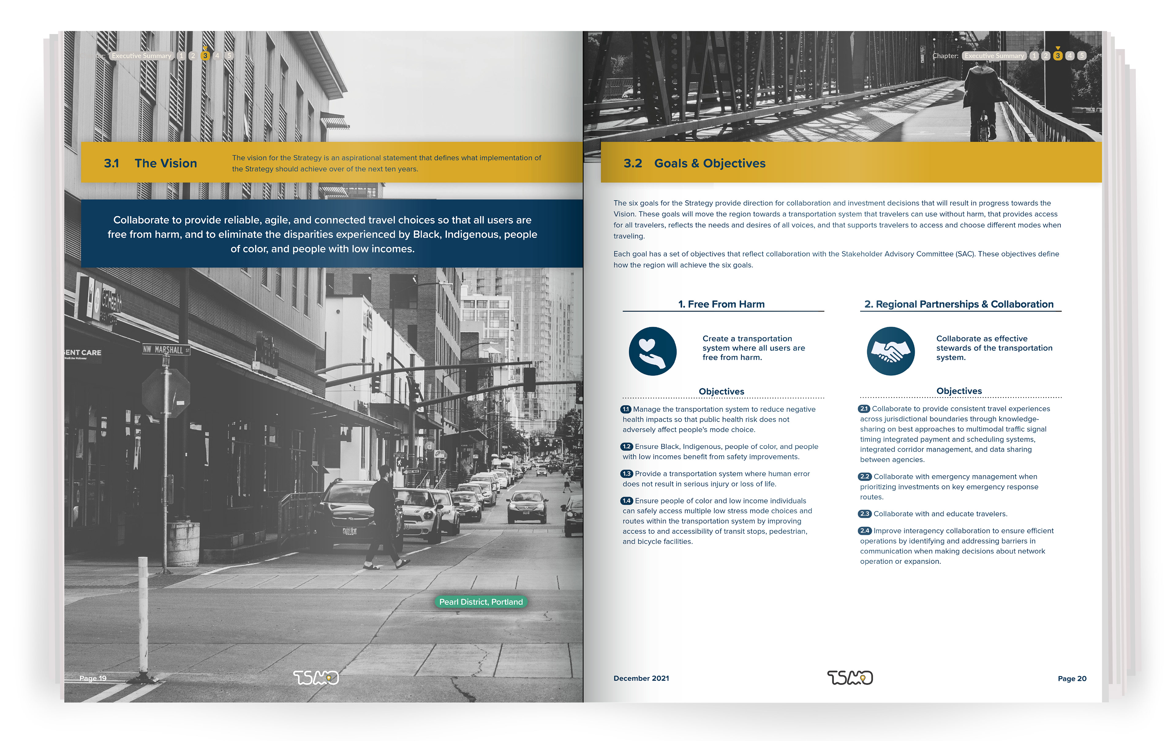
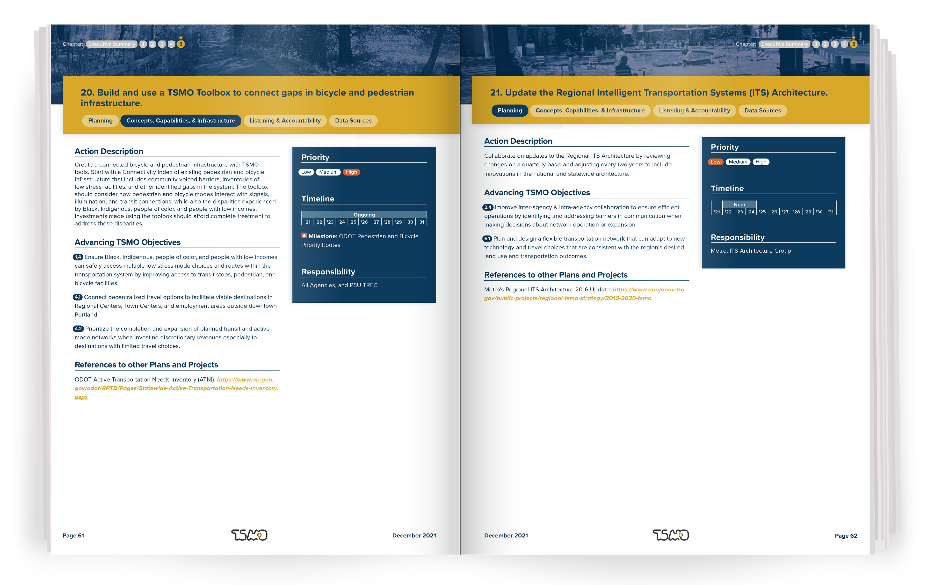
Over the course of the year-long project, I developed a visual language connecting editorial design, information graphics, illustration, iconography, and project identity. I designed the publication as a connected system, organizing varied content while giving the project a distinct personality.

Building a Visual Identity Through Narrative
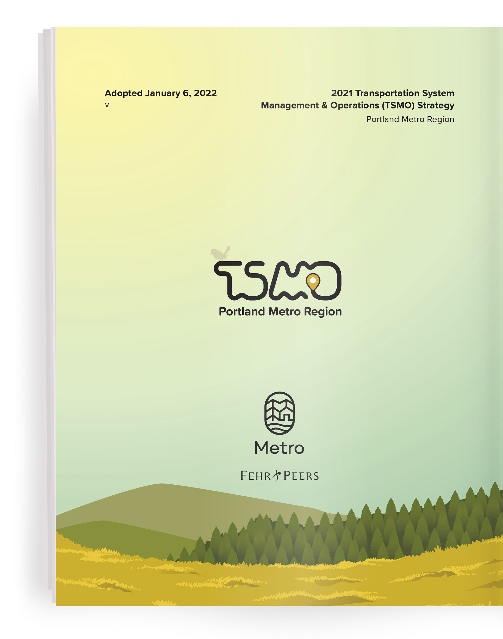
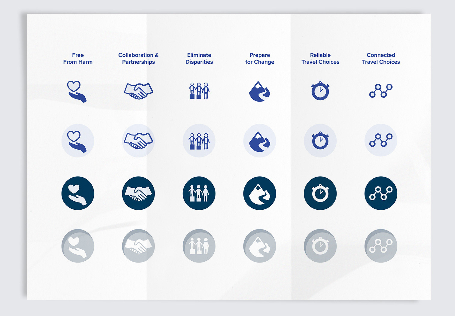
I designed the project logo around the idea of many routes arriving at a shared destination. The continuous line became both a path and a symbol for a regional strategy built around common goals. I also developed a family of icons representing the strategy’s six equity goals, giving readers recognizable visual anchors throughout the publication.
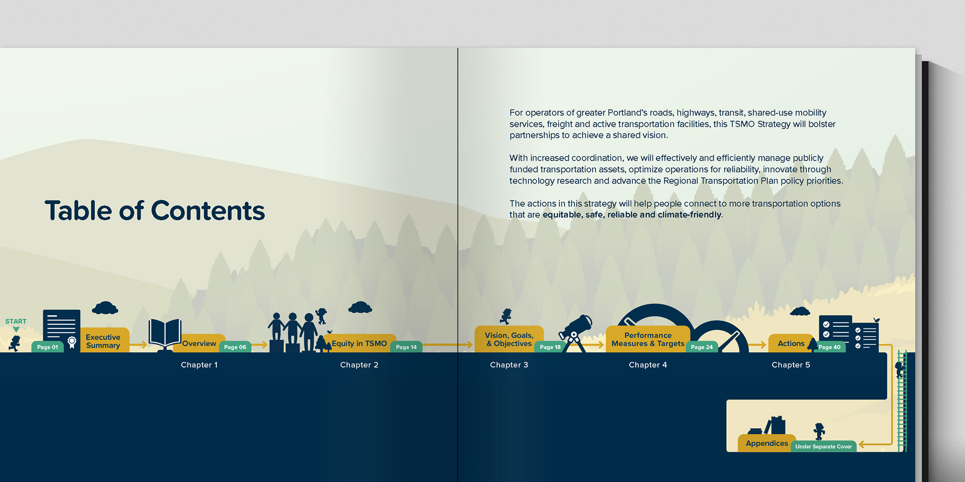
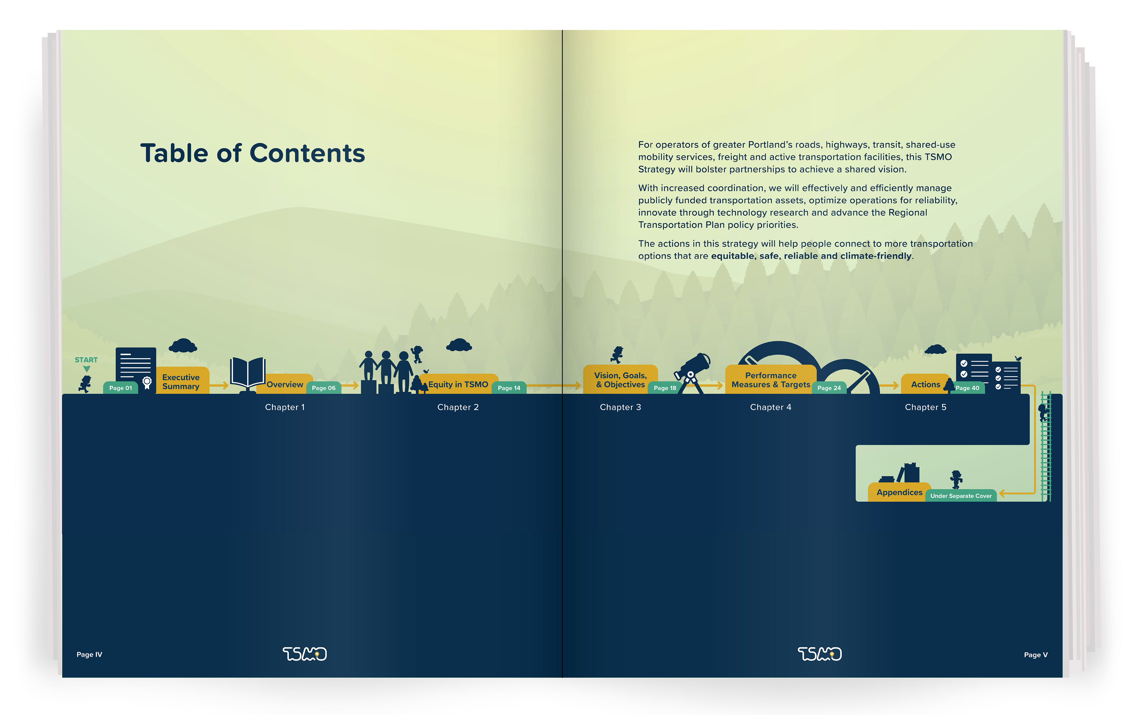
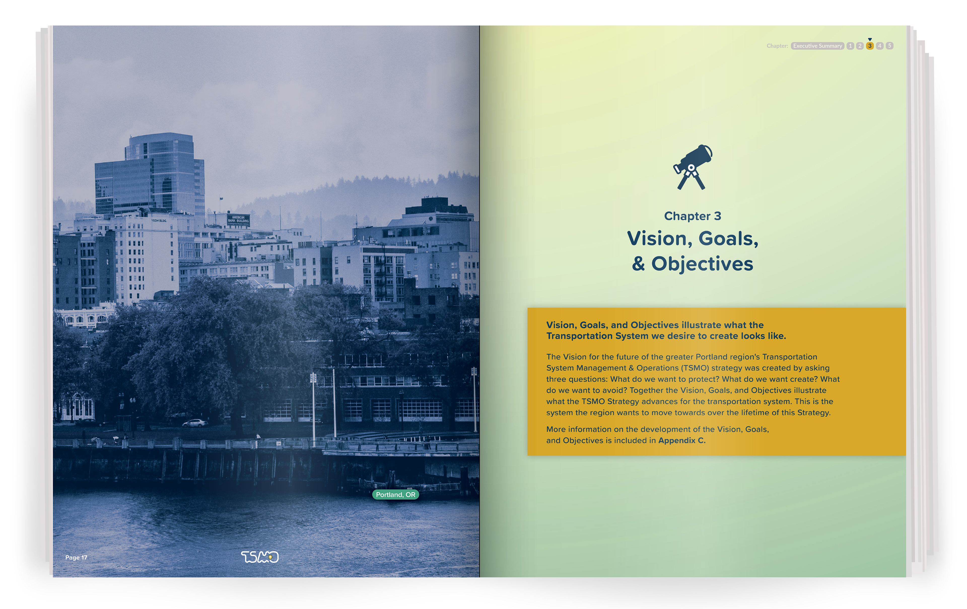
To extend that identity into the reading experience, I reframed the strategy as a hero’s journey. The table of contents became an illustrated path through the publication, with each chapter representing another stage toward the destination. This brought a sense of fun and lightheartedness to highly technical subject matter while reinforcing the project’s larger visual language.
Making Complex Information Understandable
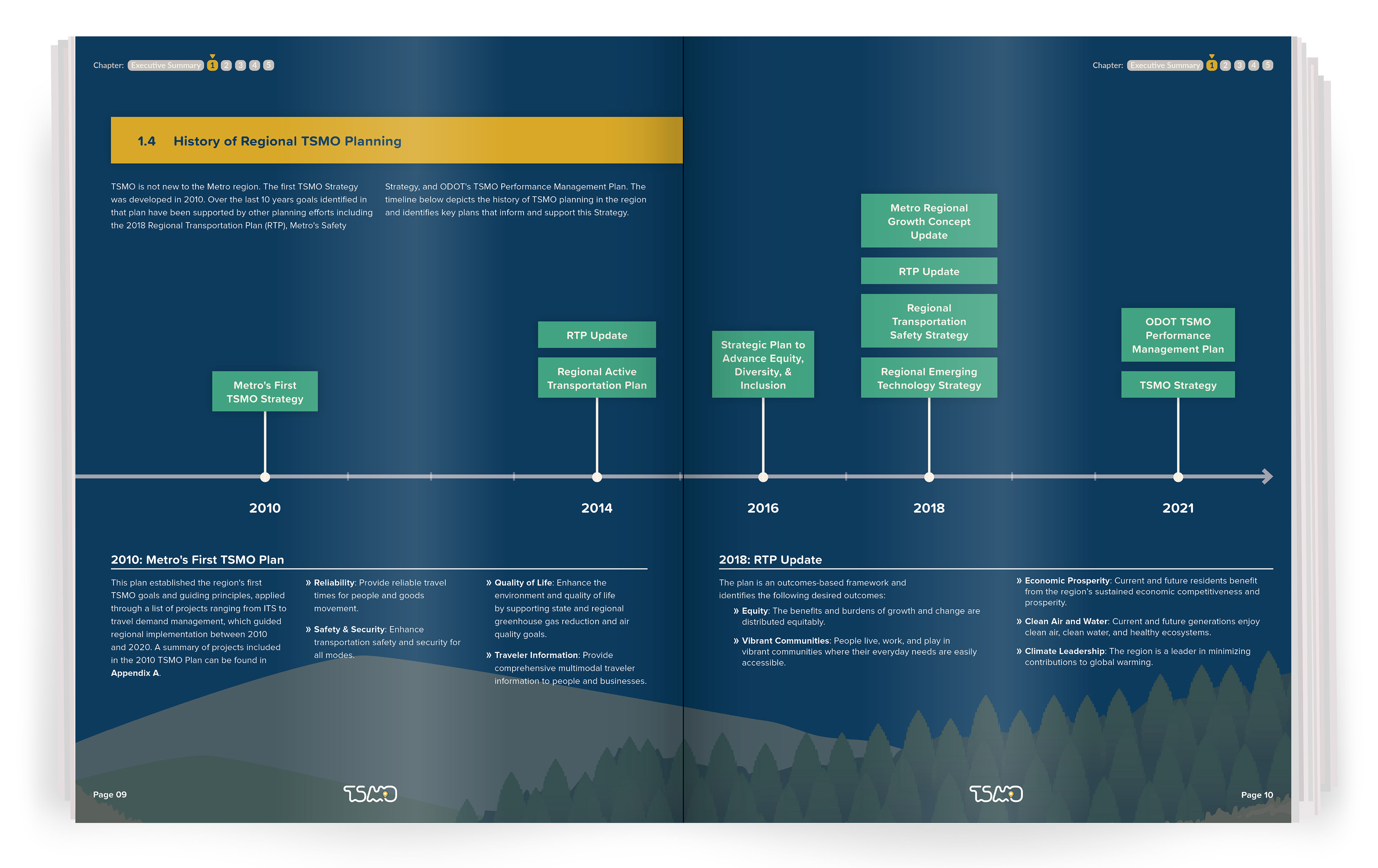
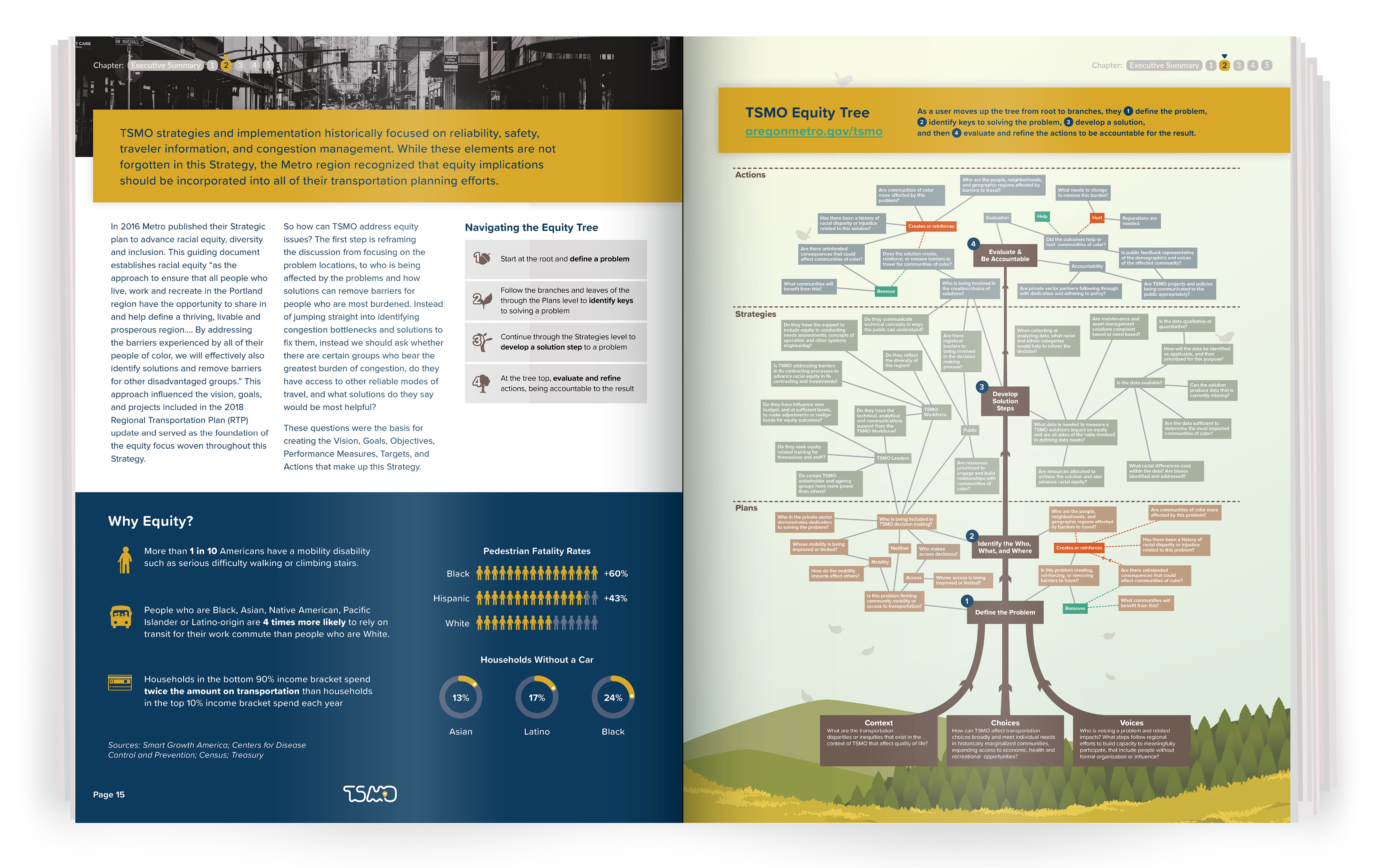
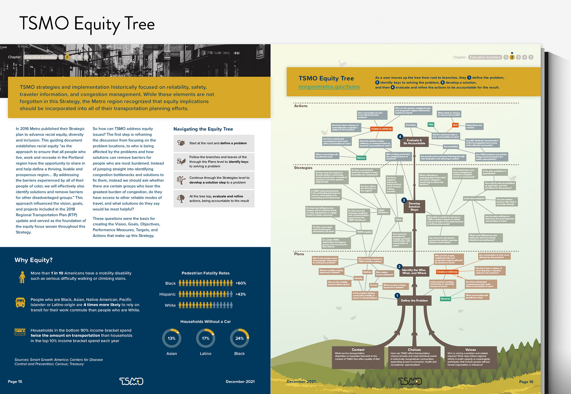
One of the publication’s central pieces was the TSMO Equity Tree, an assessment tool containing a large amount of interconnected information. I combined typography, color, illustration, iconography, and infographics to clarify relationships within the framework and make it easier to navigate. The same approach carried throughout the publication’s information-rich spreads.
The project was ultimately recognized by the National Center for Operational Excellence for its contribution to equity in TSMO.
To see the entire publication, see below: