Building a Publication System for a Complex Citywide Plan
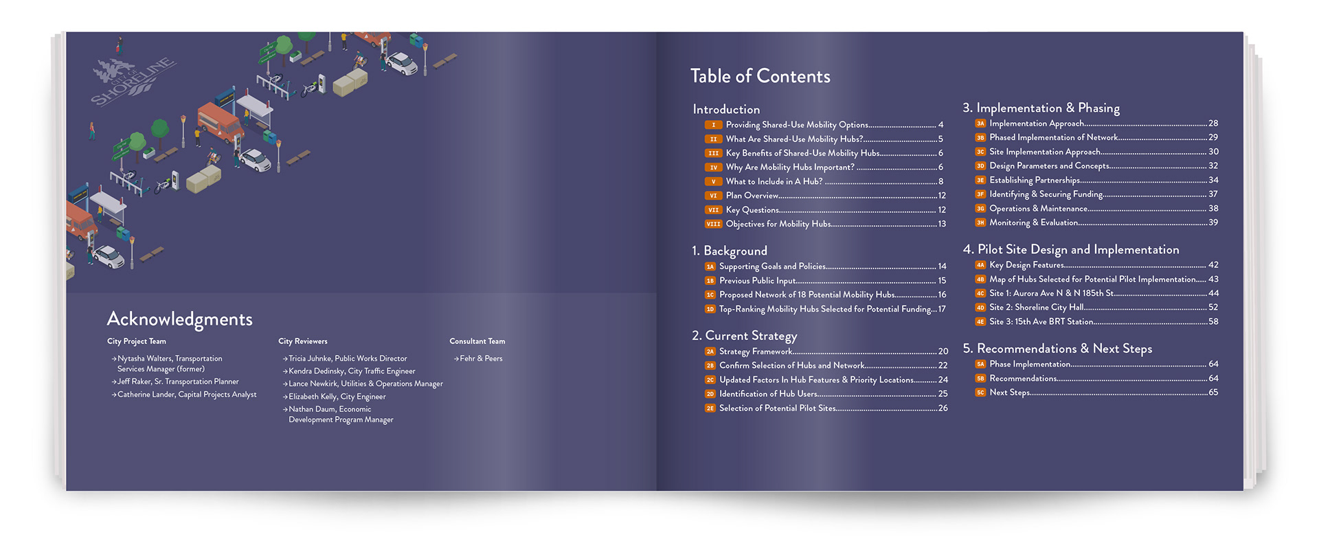
The City of Shoreline’s Shared-Use Mobility Hub Plan brings together transit, rideshare, bicycles, e-scooters, businesses, and public spaces into a coordinated network. My role was to give that complexity a clear visual structure, creating an approachable publication for residents, businesses, planners, and city officials without oversimplifying the underlying information.
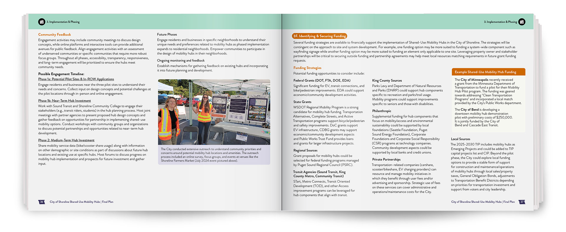
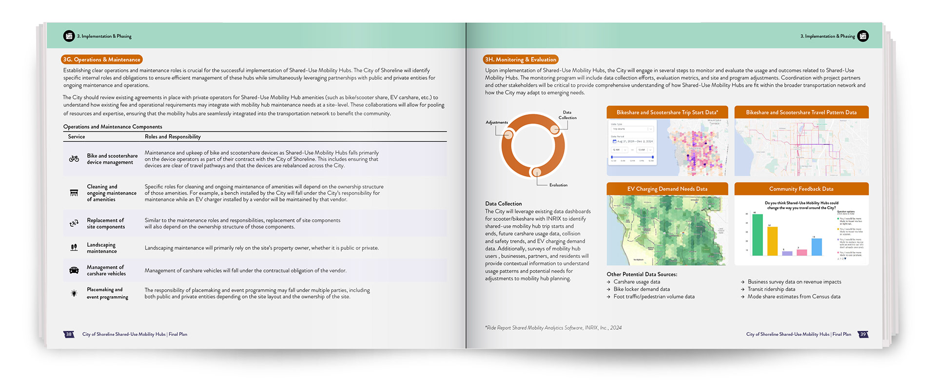
Over the course of the project, I had ownership of the publication’s visual system, integrating typography, maps, iconography, illustration, color, data, and site-specific graphics into a cohesive framework. The system had to accommodate very different kinds of content while still making the document feel consistent from beginning to end.

Creating Structure Across the Publication
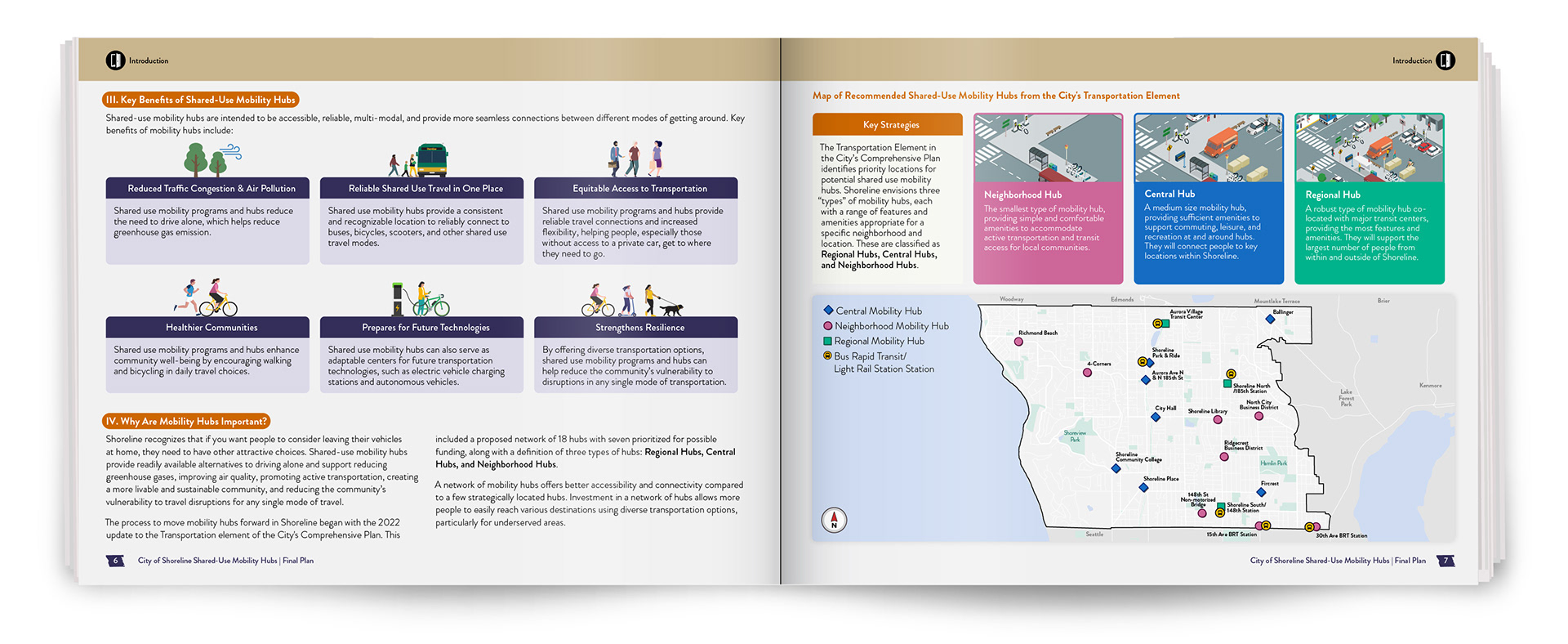
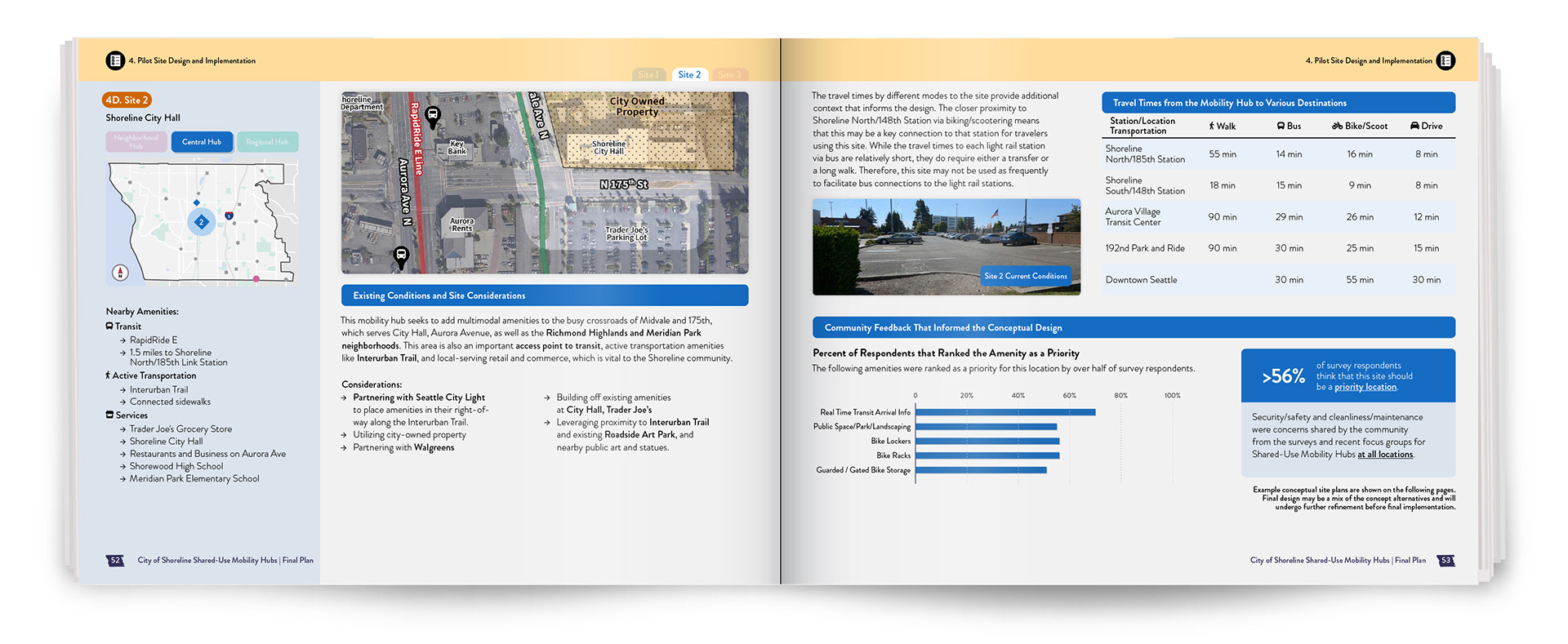
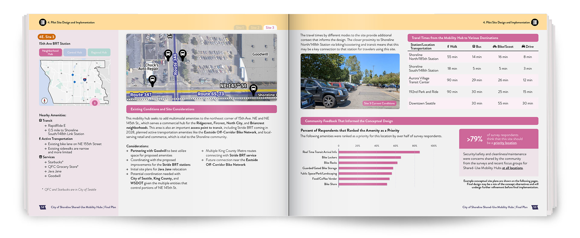
A central challenge was explaining three distinct hub types: Neighborhood, Central, and Regional. Each served different community needs and levels of connectivity, so I used color, maps, illustrations, and recurring graphic elements to help readers quickly understand how the types differed while keeping them part of the same overall system.
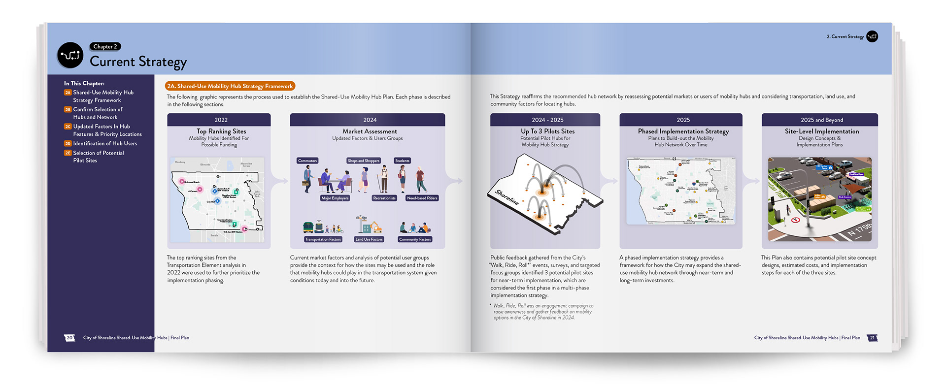
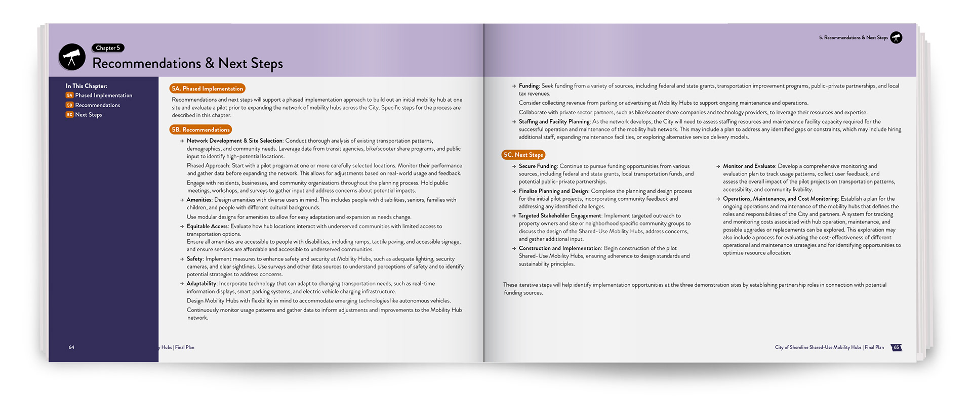
As the publication evolved through stakeholder review, repeated refinements to the color palette began to make chapter distinctions less intuitive. Rather than adding more color, I introduced unique chapter icons to create stronger separation and navigation while preserving the larger visual language.

Connecting Planning to Real Places
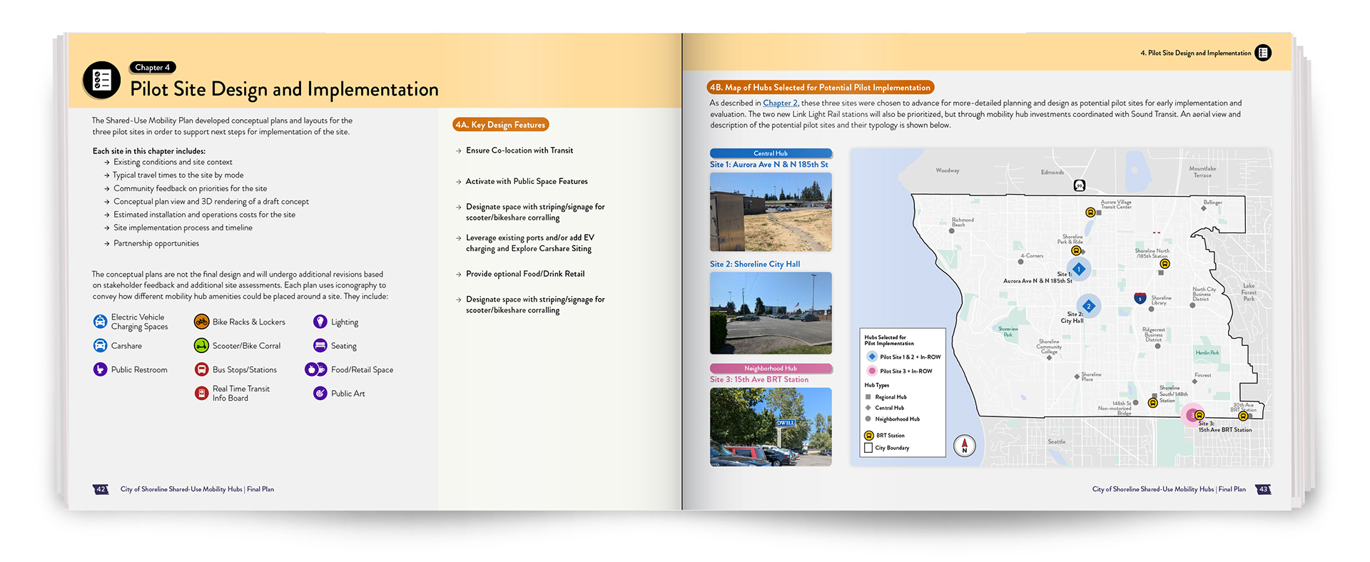
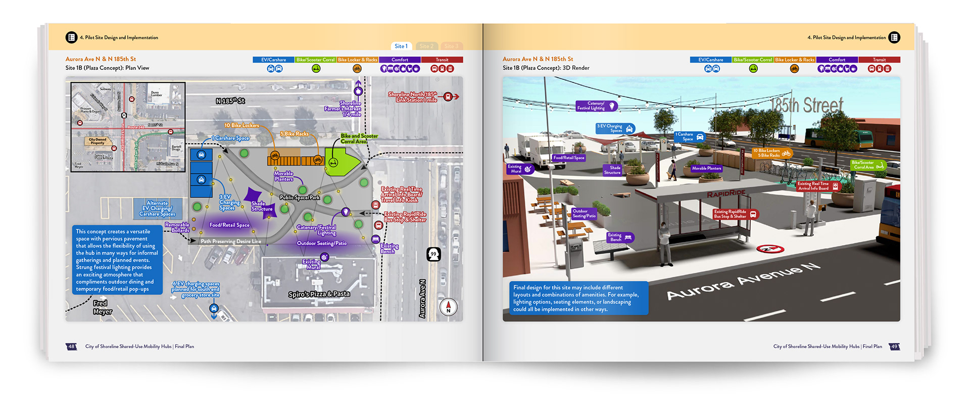
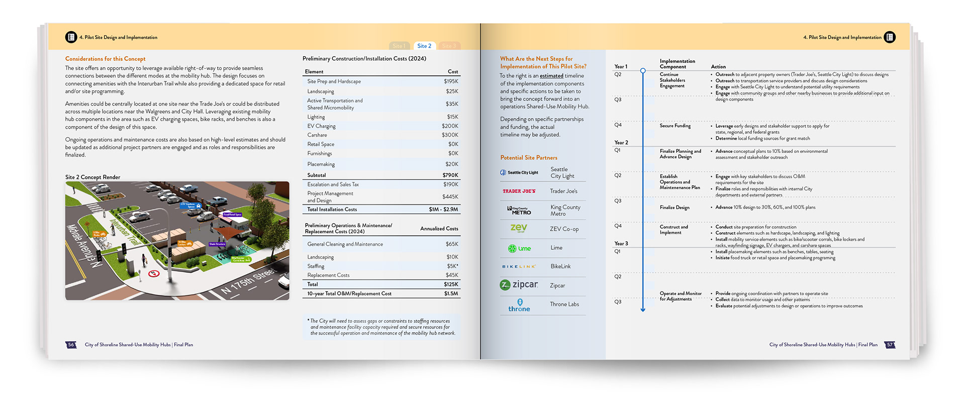
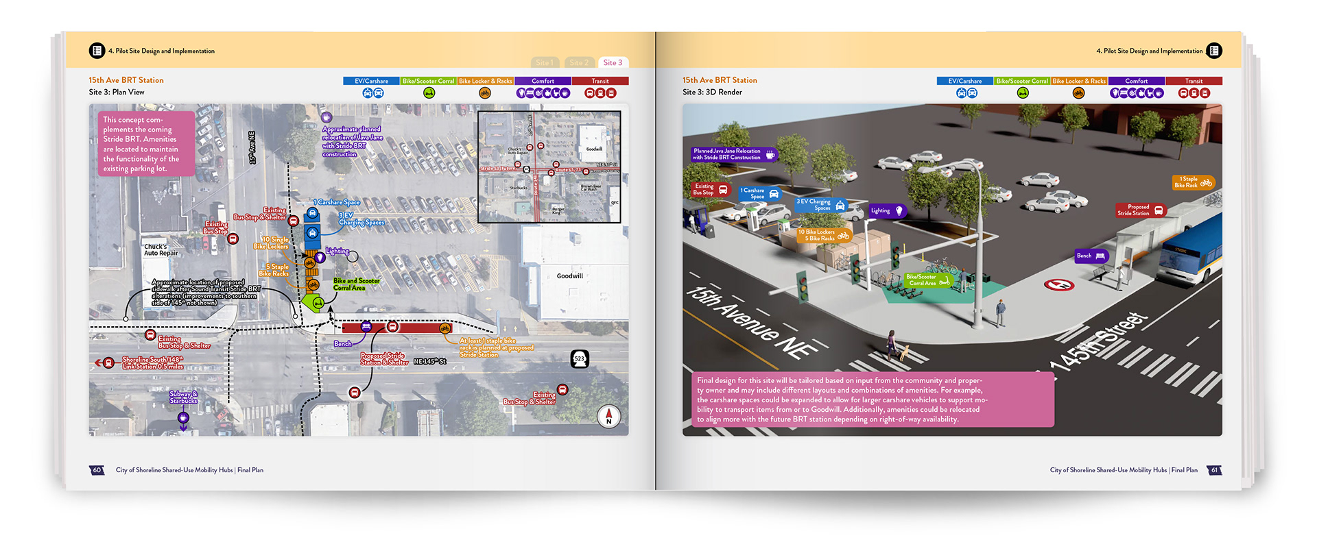
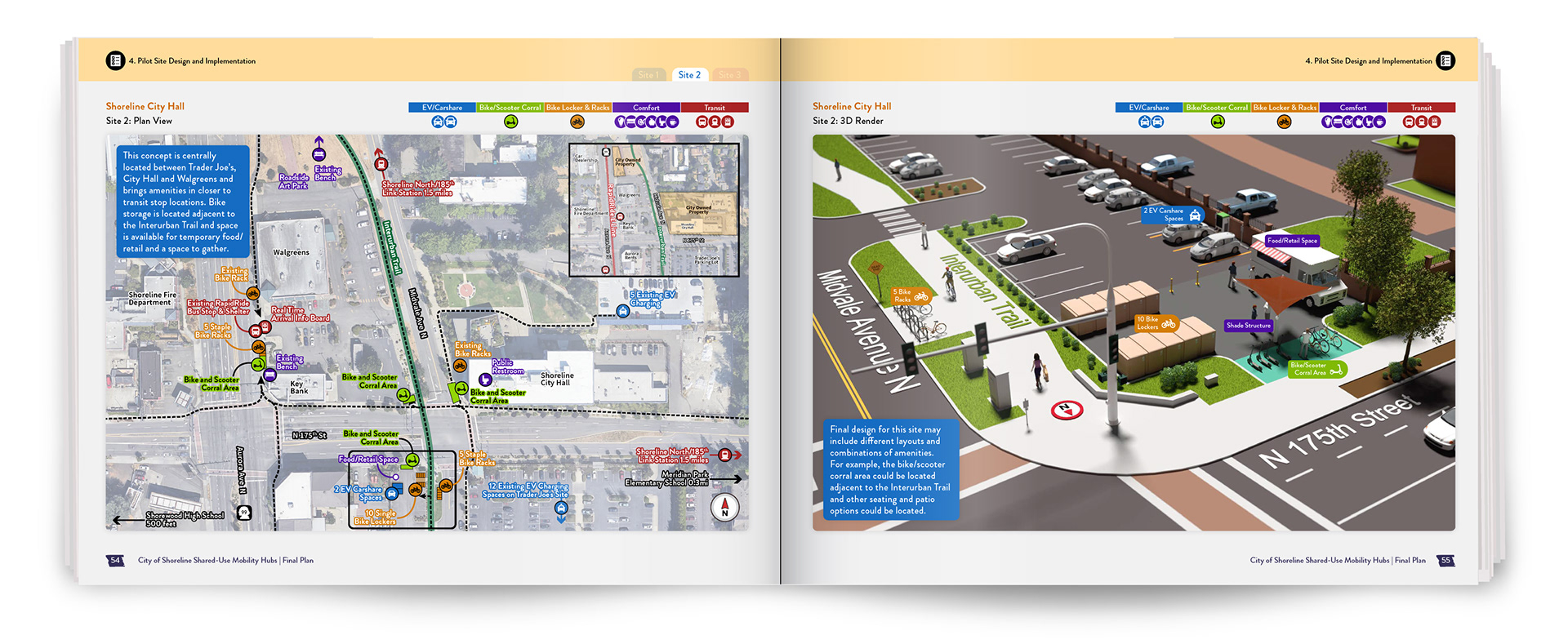
The plan also needed to show how the system would work beyond diagrams and policy. For selected sites across Shoreline, I paired 2D site planning with 3D visualization to illustrate circulation, amenities, and the user experience in specific locations. This helped connect abstract recommendations to places readers could understand spatially.
Designing for Clarity at Scale
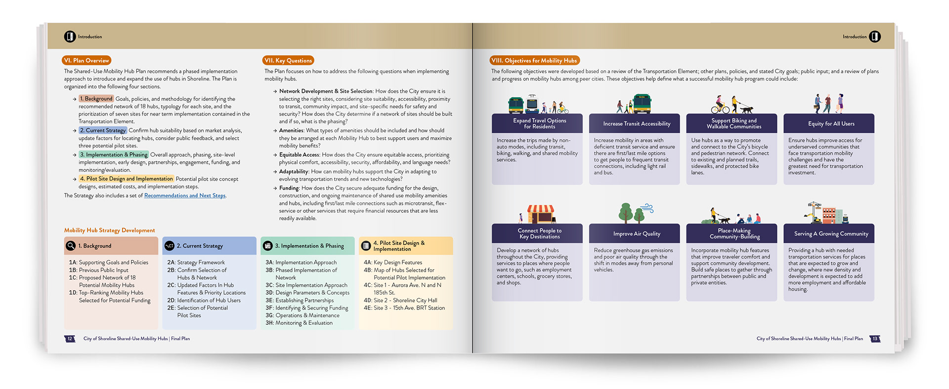
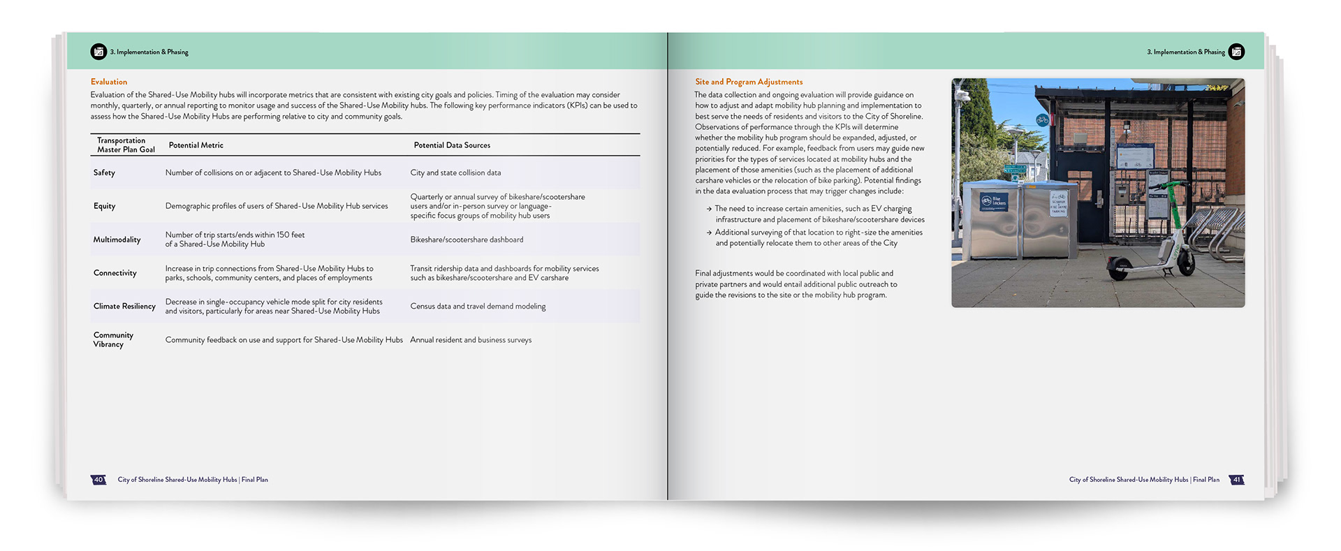
The publication brought together maps, diagrams, illustrations, technical guidance, and site-specific information across a large body of work. I approached it as a connected editorial system rather than a collection of individual pages, using consistent hierarchy, typography, color, iconography, and navigation to help readers move through changing types of content without losing context.
My InDesign, Illustrator, and Photoshop workflow was built to support that scale. Linked artwork, reusable assets, and structured styles allowed graphics and layouts to evolve throughout review while maintaining consistency across the publication.

For me, the project demonstrates how thoughtful editorial design can make a complicated subject feel organized, approachable, and visually engaging while still preserving the depth of the information.
To see the entire publication, see below: