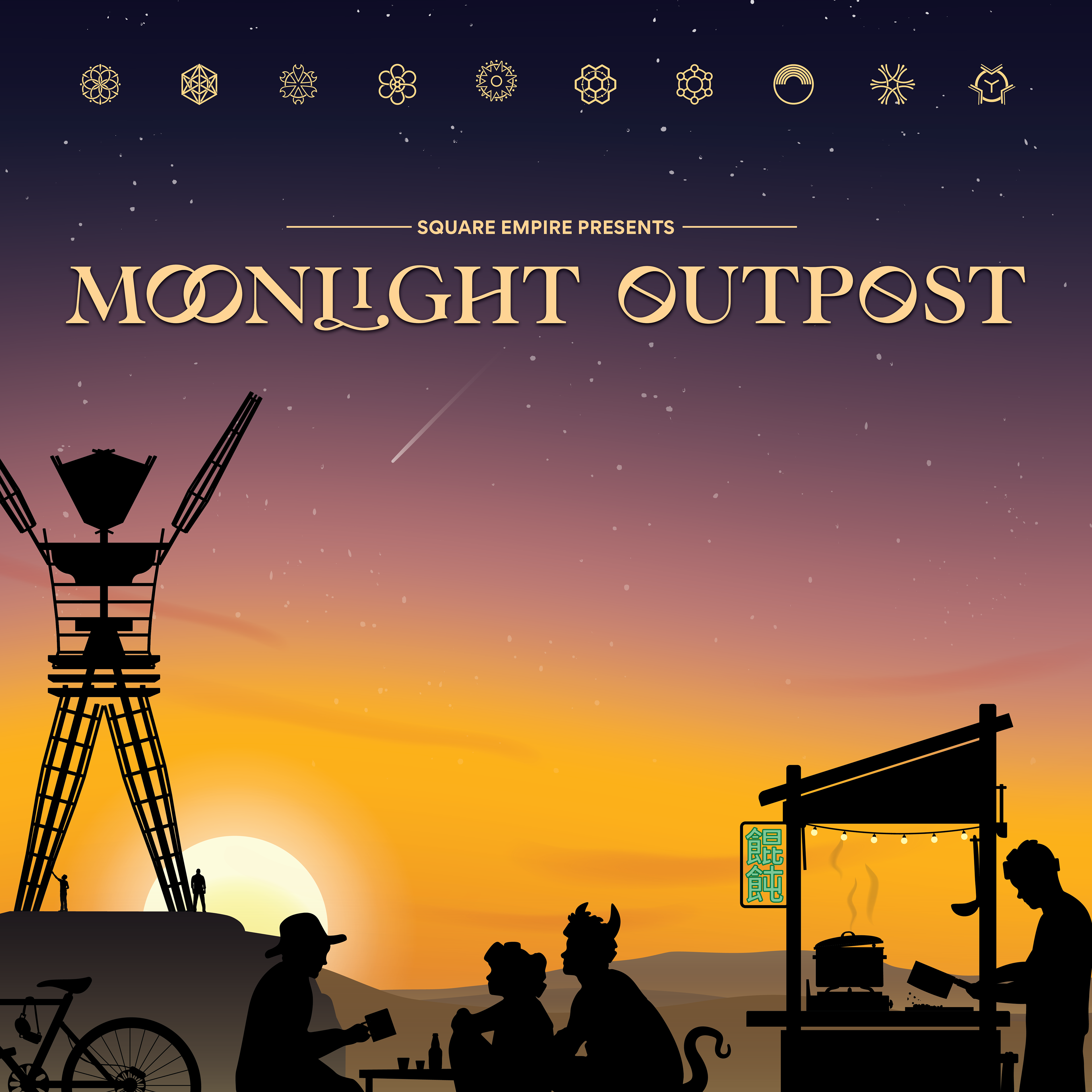
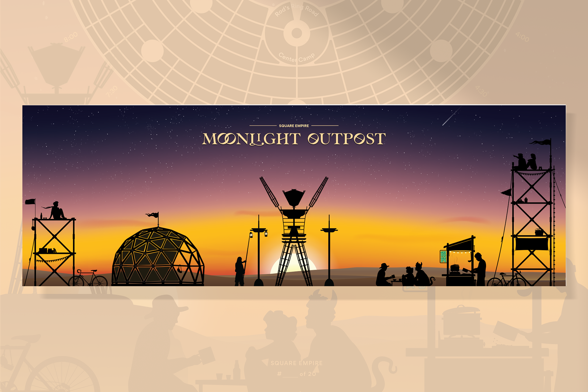
Moonlight Outpost is a Hong Kong inspired night market food stall created for Burning Man. The project explores how illustration, print design, and environmental design can combine to create a cohesive experience.
Drawing inspiration from the vibrant neon alleys of Hong Kong and the nostalgic visual language of Chinatown restaurants from the 1970s through the 1990s, I developed a visual identity that blends traditional Chinese calligraphy with contemporary design.
The resulting system extends across restaurant menus, business cards, merchandise, digital media, and the physical installation of the Moonlight Outpost wonton cart itself.
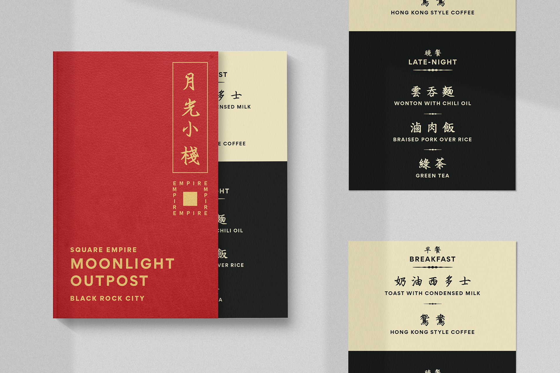
The below menu presents food served at Moonlight Outpost. The design draws upon cherished memories of my childhood spent dining in Hong Kong restaurants in Chinatowns across the US. These establishments, with their vibrant red and opulent gold foil accents, left an indelible mark throughout the 70s, 80s, and 90s. I sought to encapsulate this nostalgia through a contemporary lens. English text is presented in a minimalist font for a modern aesthetic. To evoke the sentimentality of Hong Kong's heritage, I opted for a traditional Chinese calligraphy typeface.
An extensive range of collateral was designed, including vinyl stickers, postcards, pendants, business cards, and digital wallpaper for both desktop and mobile. These elements further reinforced the design language and brand aesthetic.
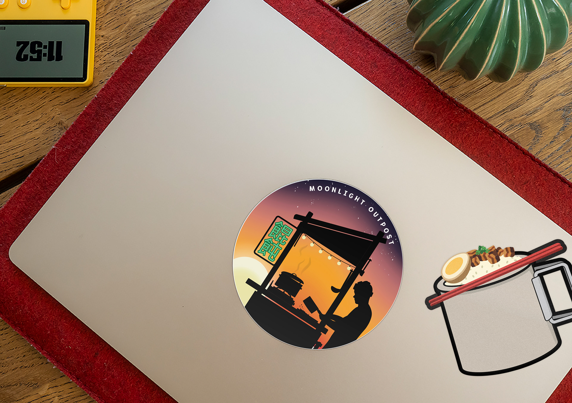
Die-cut vinyl stickers
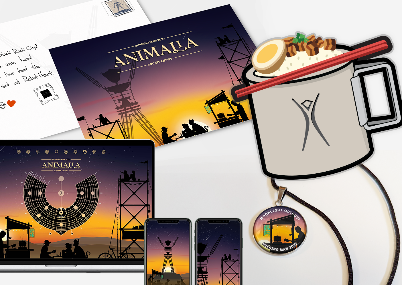
Postcards, desktop + mobile wallpaper, pendents
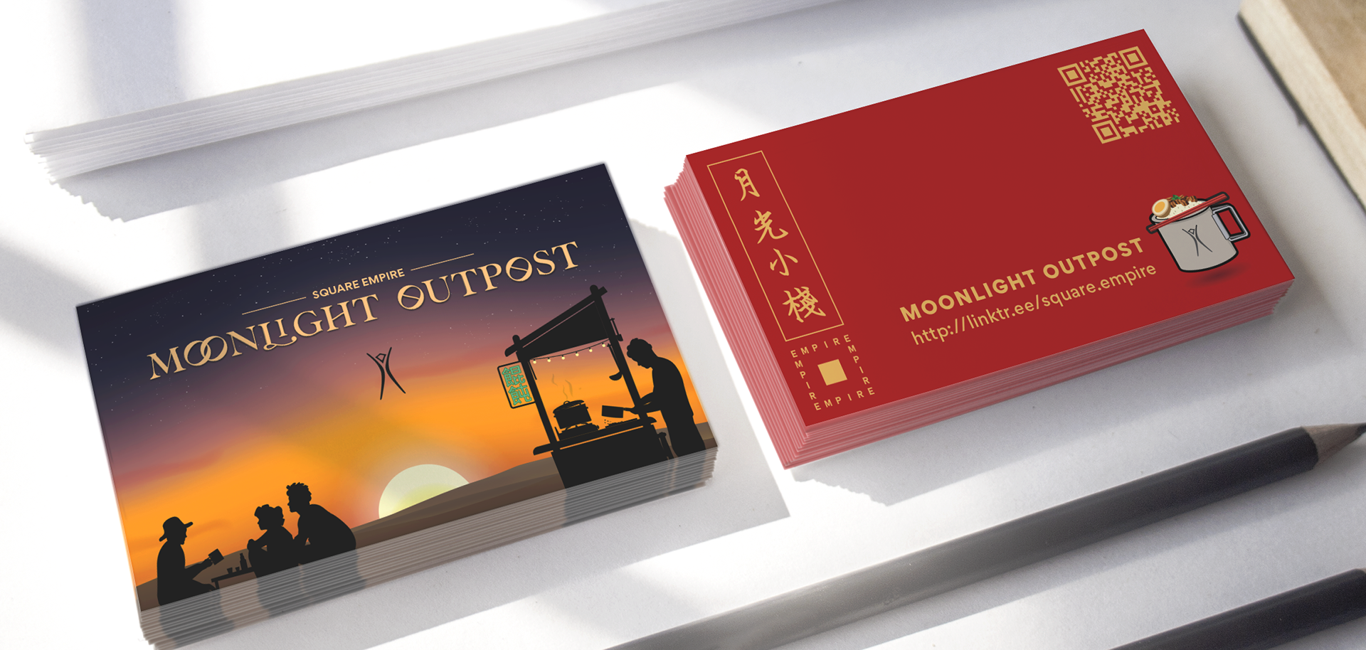
Business cards
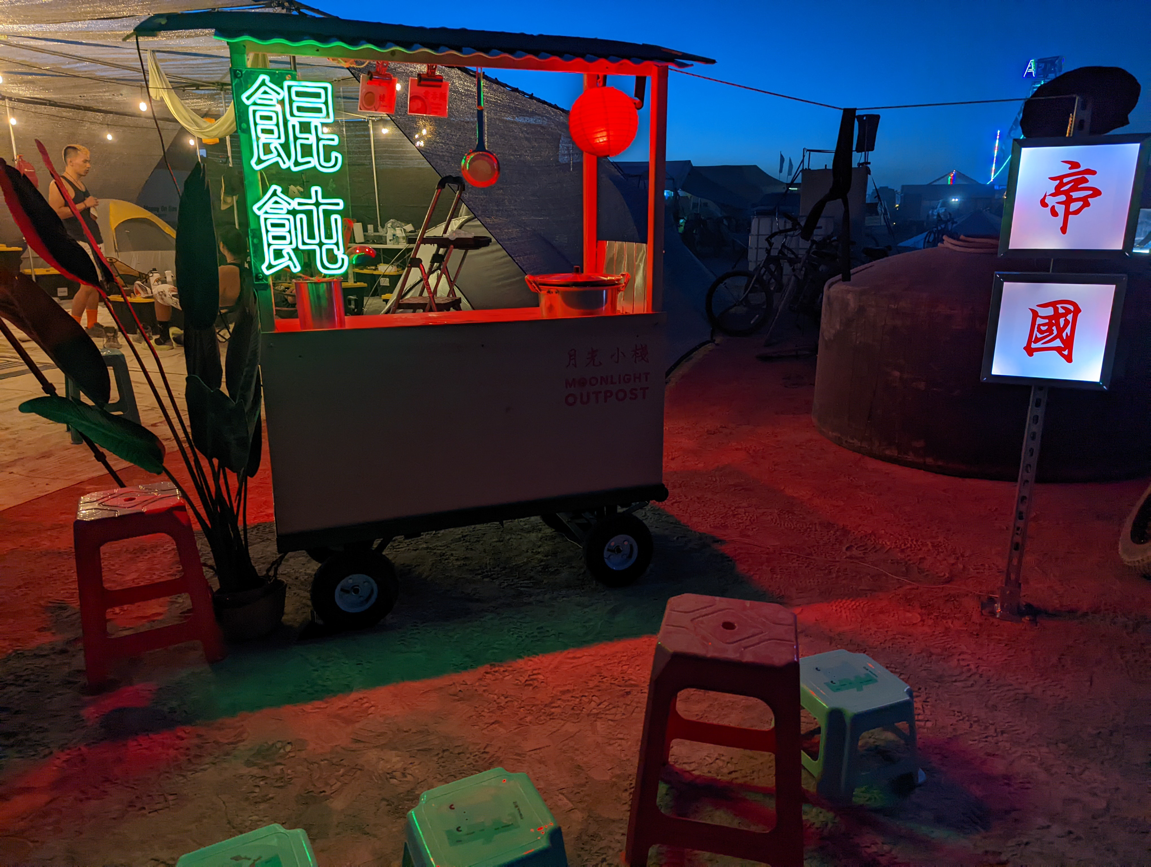
Moonlight Outpost Wonton Cart in the built environment. This project demonstrates how a complete visual design system can translate into the built environment. The experience of Moonlight Outpost showcases the bridge between the design world and the experience of the participants in the built environment.