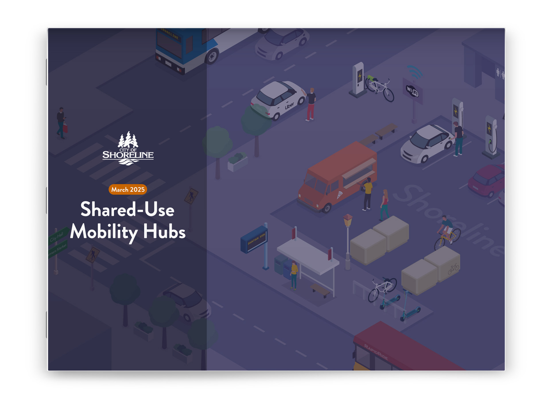
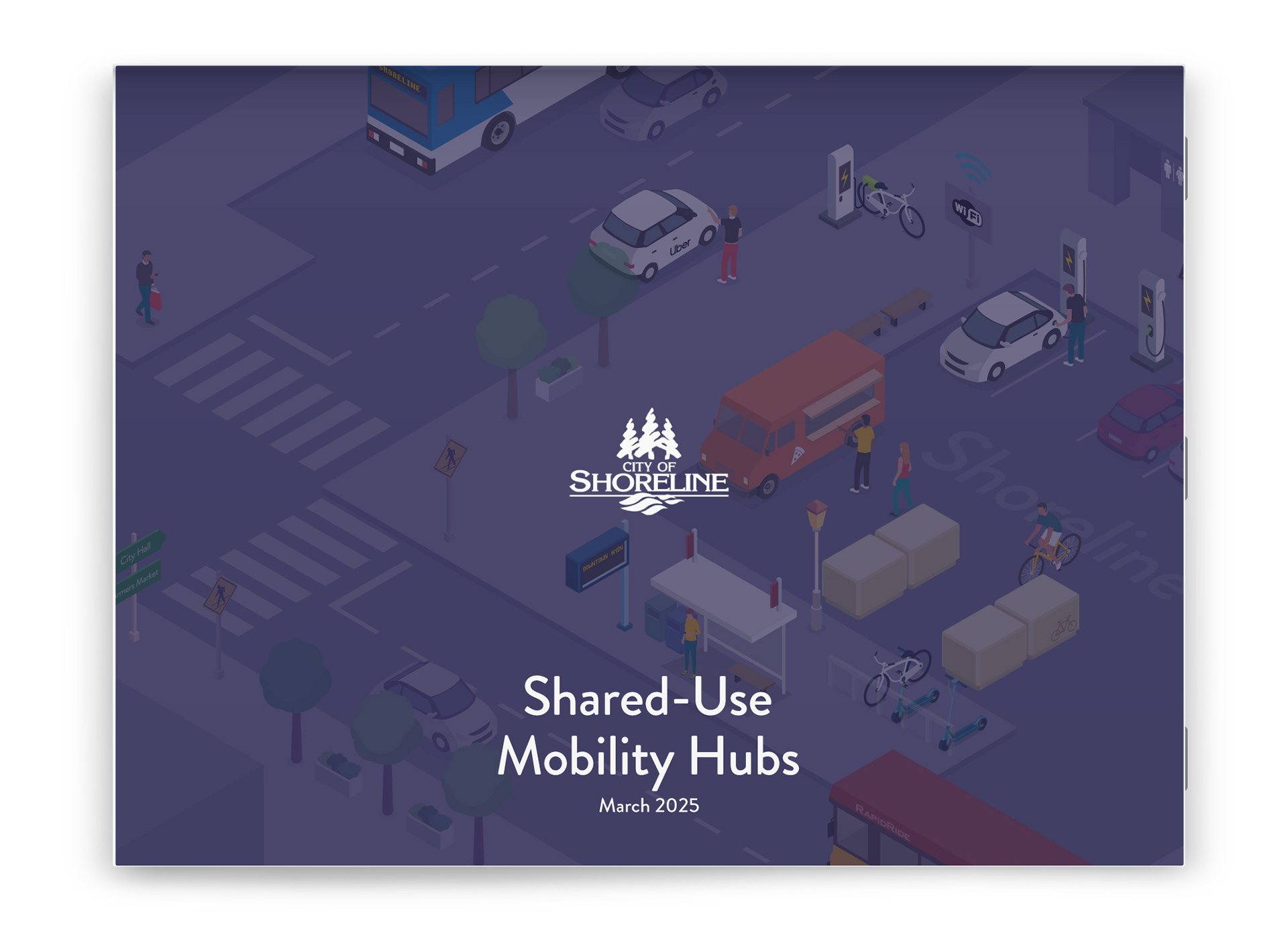
Imagine catching a bus, grabbing an Uber, or locking up your bike seamlessly all in one spot. No scrambling between stops or switching modes. Just smooth, stress-free travel that fits how people actually move. That’s the vision behind shared-use mobility hubs.
This project explores how graphic design can make that kind of complex, policy-heavy idea feel clear, relatable, and human for the City of Shoreline, WA.
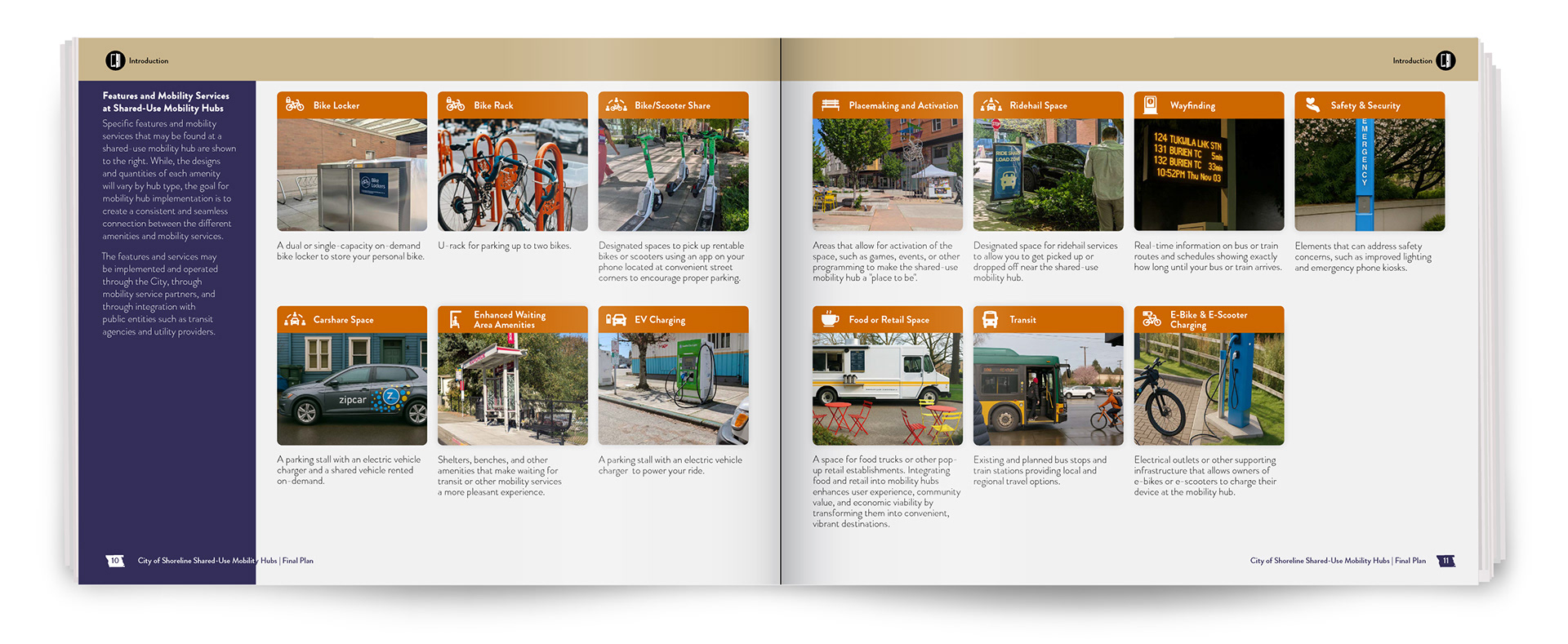
A shared-use mobility hub connects walking, biking, transit, and rideshare in one place, designed around how people actually move.
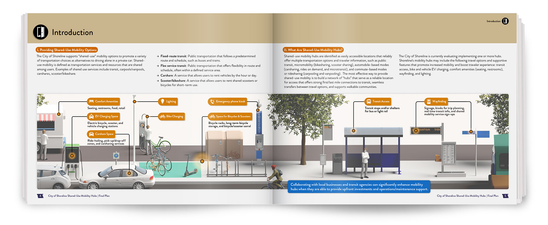
The real challenge wasn’t the plan itself, but making complexity feel navigable. The design work focuses on showing how different ways of moving connect, overlap, and support everyday travel. The work spans typography, iconography, maps, isometric illustrations, and 3D views. Each format clarifies a different layer of understanding, from the big-picture to human-scale experience.
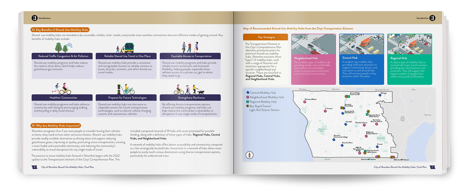
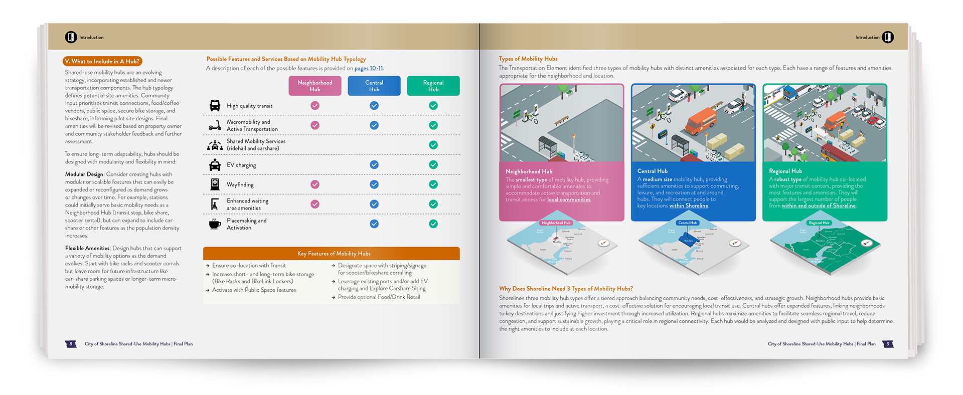
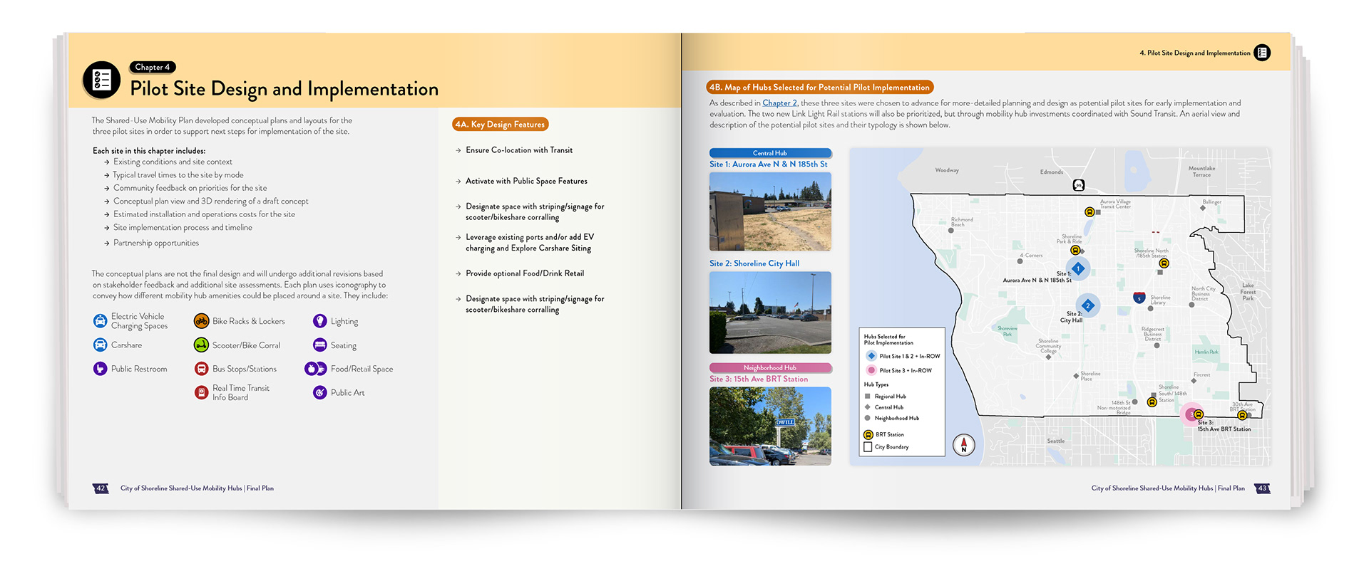
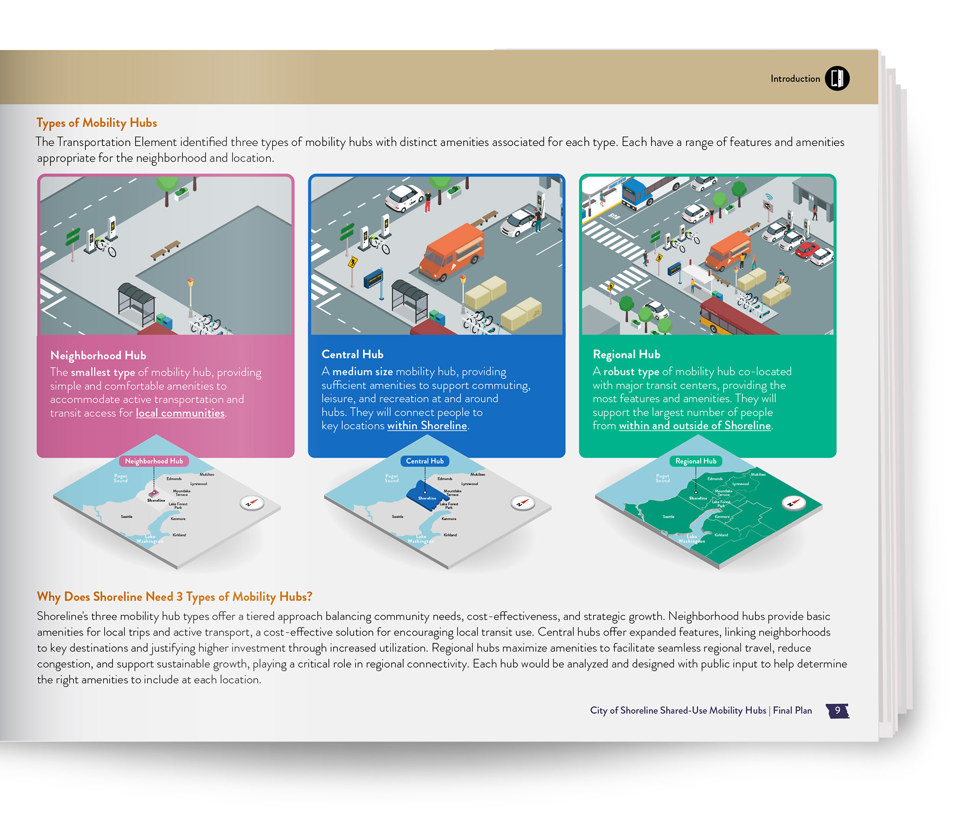
A key part of the plan was visually representing three types of shared-use mobility hubs: Neighborhood, Central, and Regional. I used color-coded text, illustrations, and maps to show how each type is tailored to different parts of the community:
Illustrating the System in 3D
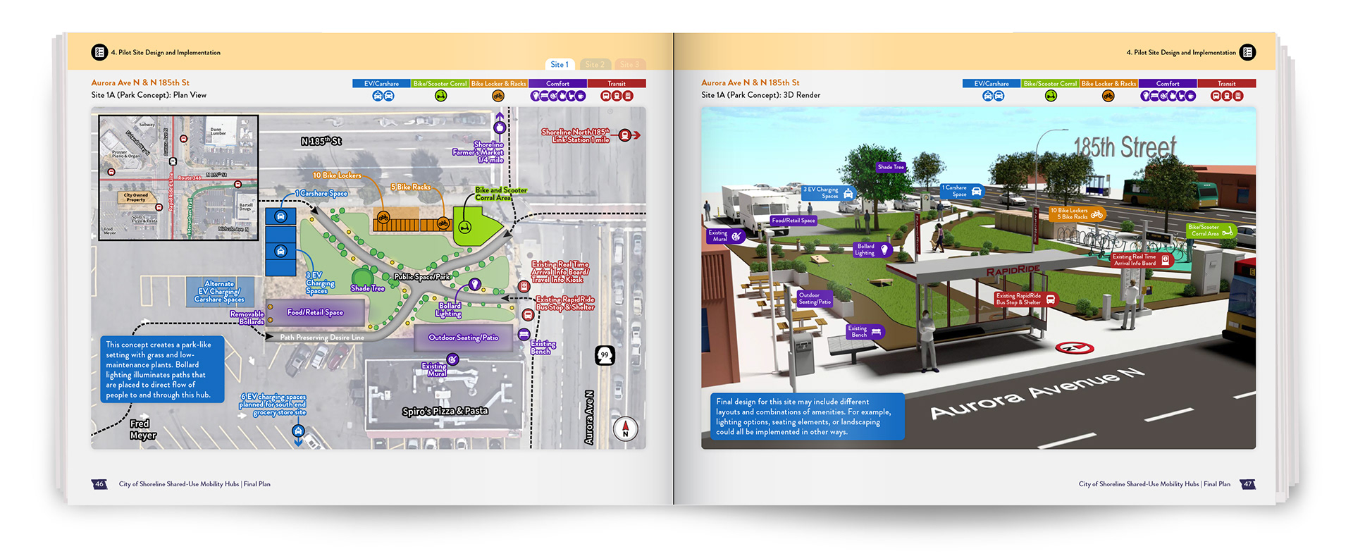
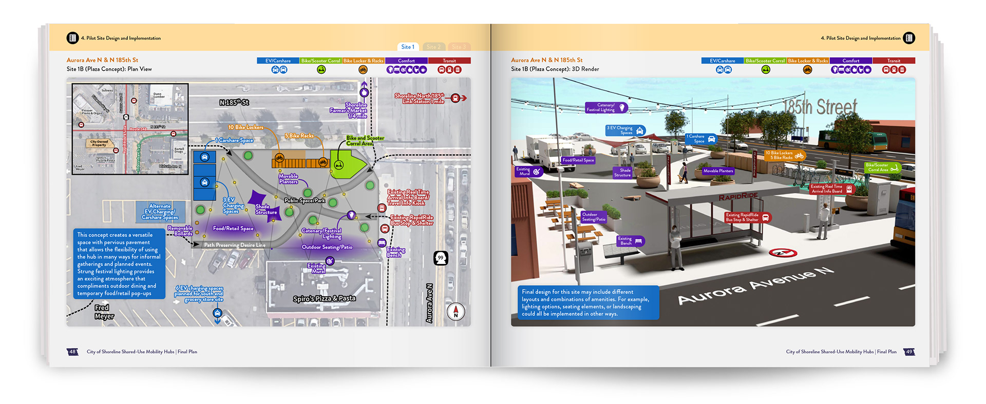
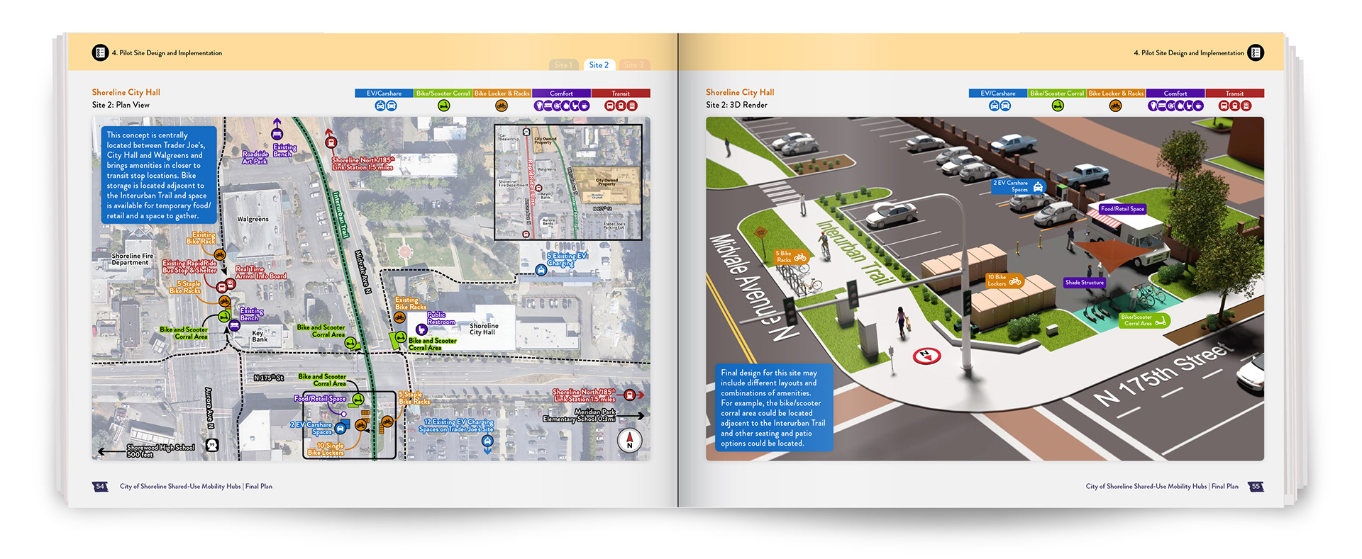
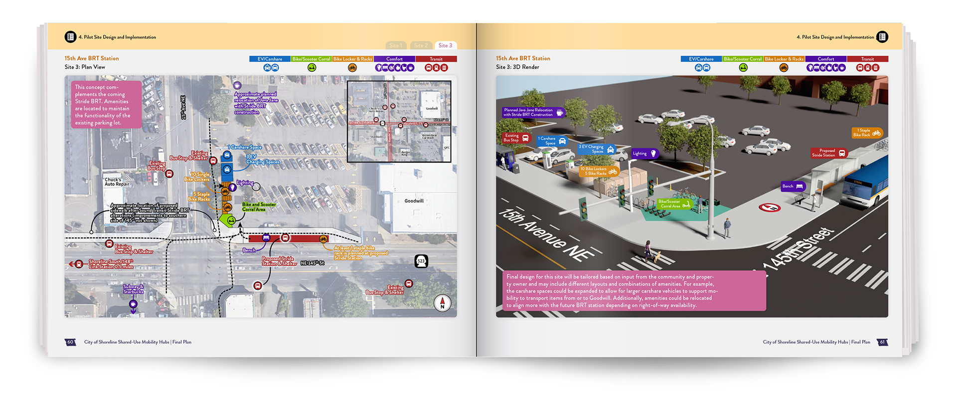
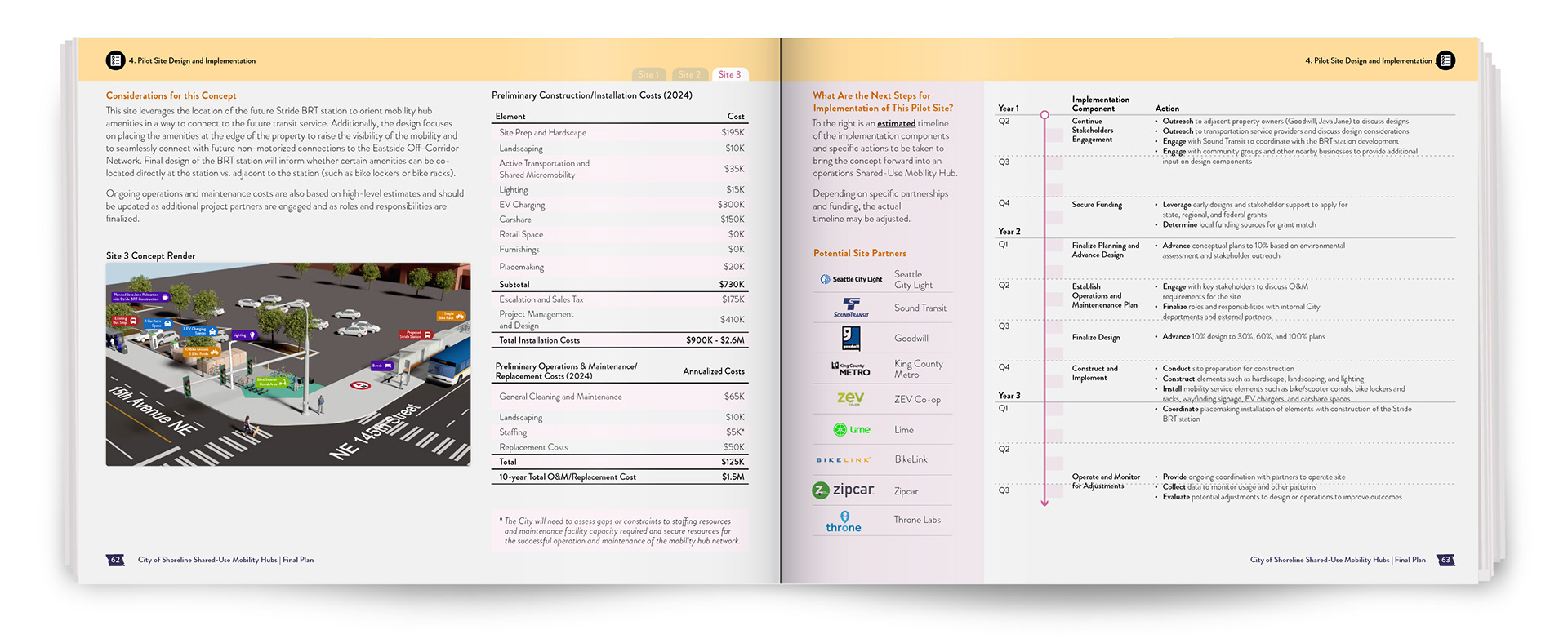
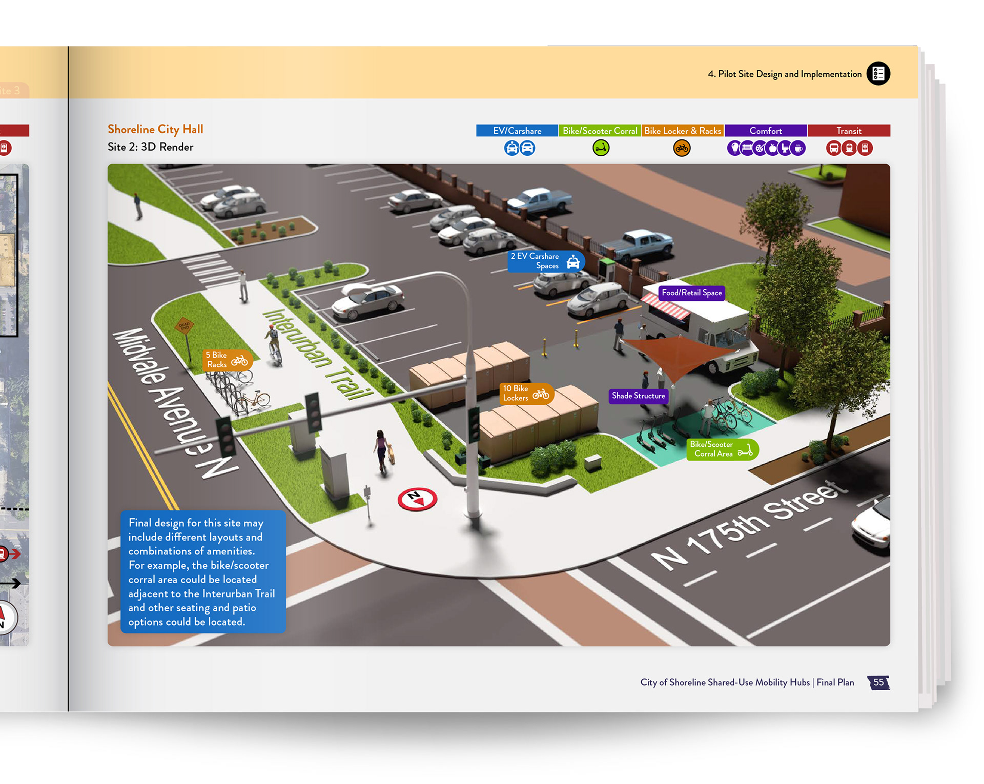
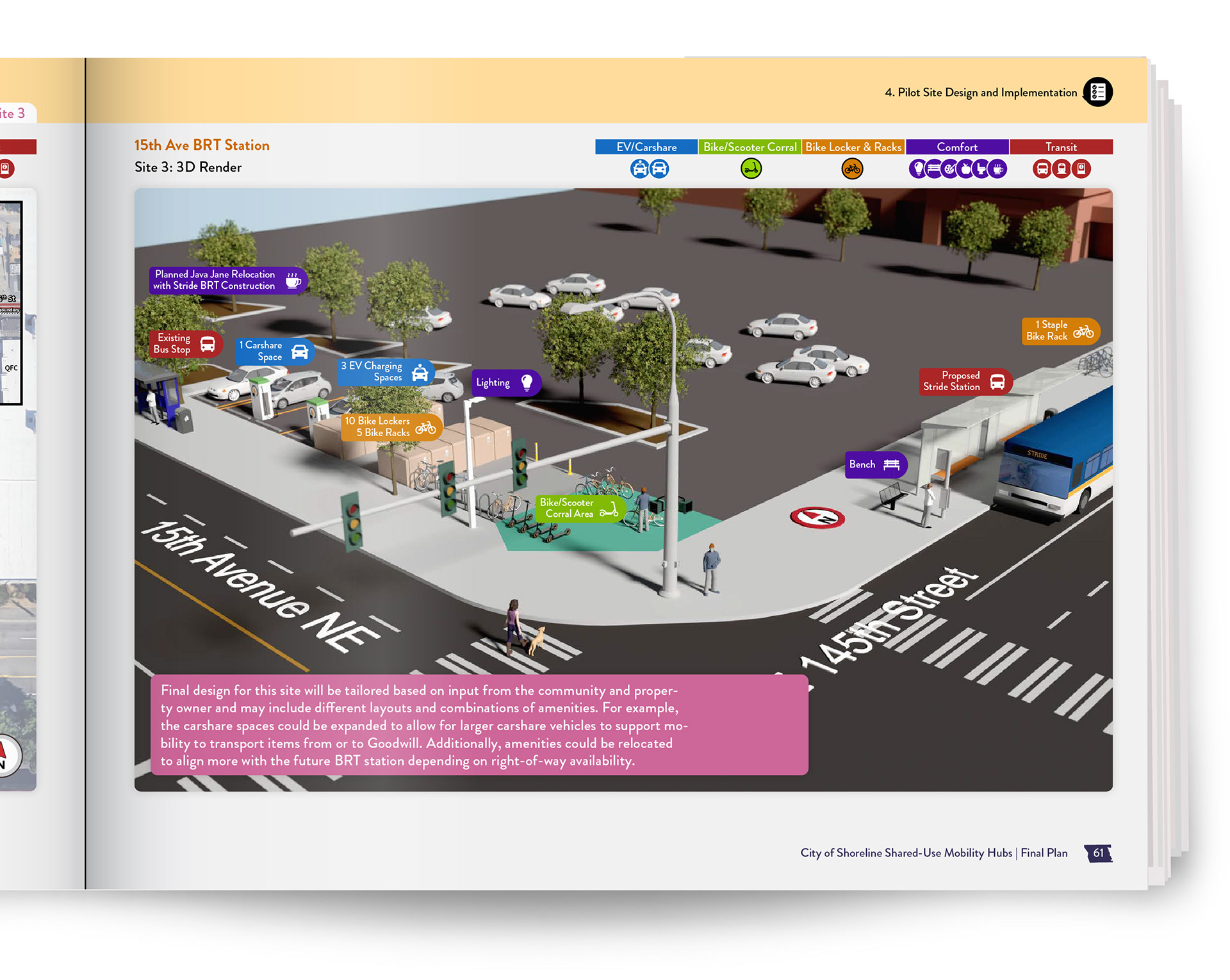
Conceptual designs for pilot locations below show how mobility hubs look as real places. By combining 2D site plans and 3D views, I show how a public space can look and feel as a shared-use mobility hub:
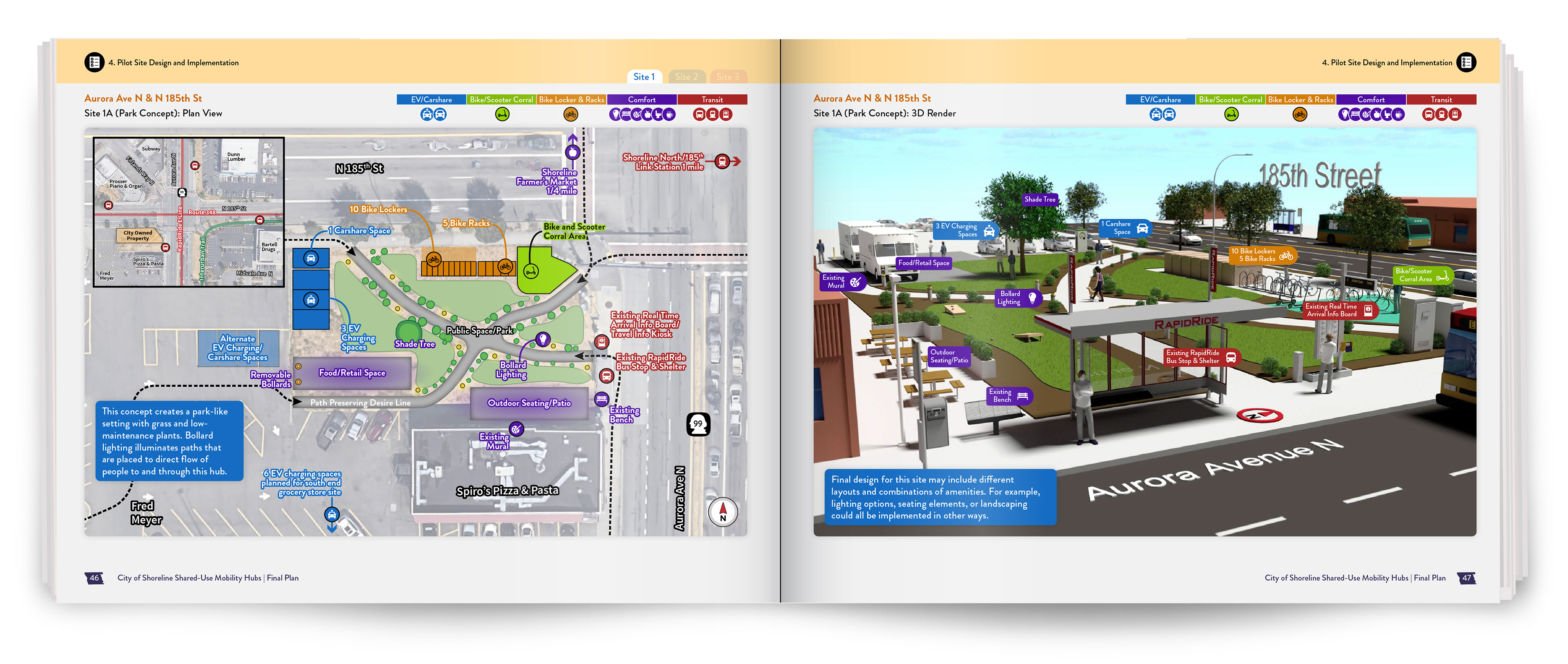
Left: 2D Site Plan, Right: 3D Visualization
There's more! Check out the entire plan below: