Client: Earth 24/7
Earth 24/7 is dedicated to fostering environmental consciousness and activism within communities. Their mission centers on cultivating a sustainable planet where human and natural ecosystems not only coexist harmoniously, but thrive together.
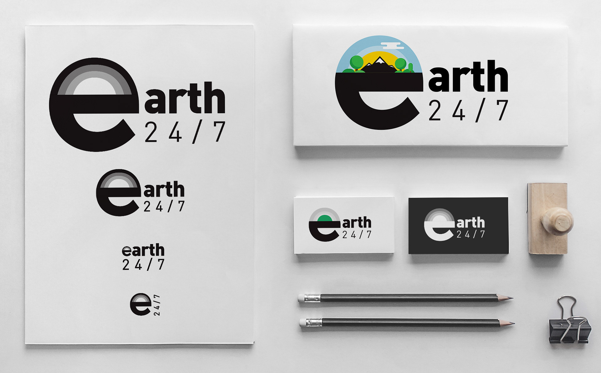
I designed this logo with scalability and adaptability in mind, ensuring it carries across a rangeof media formats. The "e" serves as a succinct yet evocative symbol for Earth, offeringimmediate recognition. Nestled within the "e" is an area open for thematic design. Below areexamples which include a radiating sun and a scene depicting mountains and trees. Thisversatility allows the logo to change based on marketing strategies while maintaining it'ssymbolism.

Client: Sy M. Nakao D.D.S.
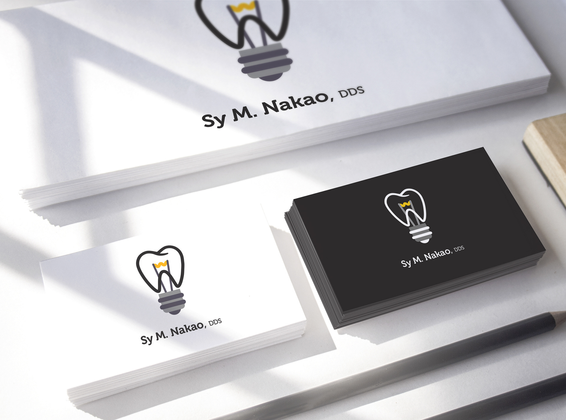
This logo design began with discussions to understand the client's vision for their dental practice. They wanted a logo that was simple, easily recognizable, and infused with a sense of joy—adding a lighthearted touch to the dental experience. The final design is a playful fusion of a tooth and a lightbulb, symbolizing the practice's mission to brighten their patients' smiles.
Client: Portland Metro
A continuous route forms the letterforms and leads to a shared destination, symbolizing different paths moving toward a common regional goal.
