I collaborated with data scientists to develop this infographic showing travel patterns in Kauai County, Hawaii. Since the COVID pandemic, people have drastically changed the frequency and purpose of travel within the county. This graphic aims to reveal some of those those patterns to help make better informed transportation decisions. The lively color palette and semicircular bar charts depict a rainbow motif and serve as a tribute to Hawaii, also known as the "Rainbow State".
Let's break down this infographic to better understand what the data is telling us.
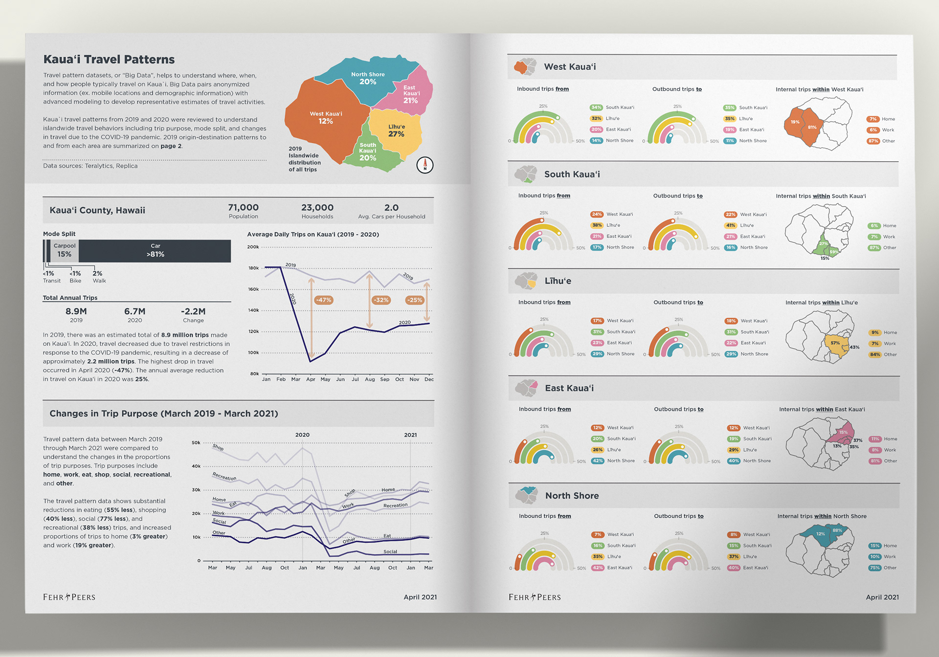
Travel drastically decreased due to travel restrictions in response to the COVID-19 pandemic. The highest drop in travel occurred in April 2020 (-47%).
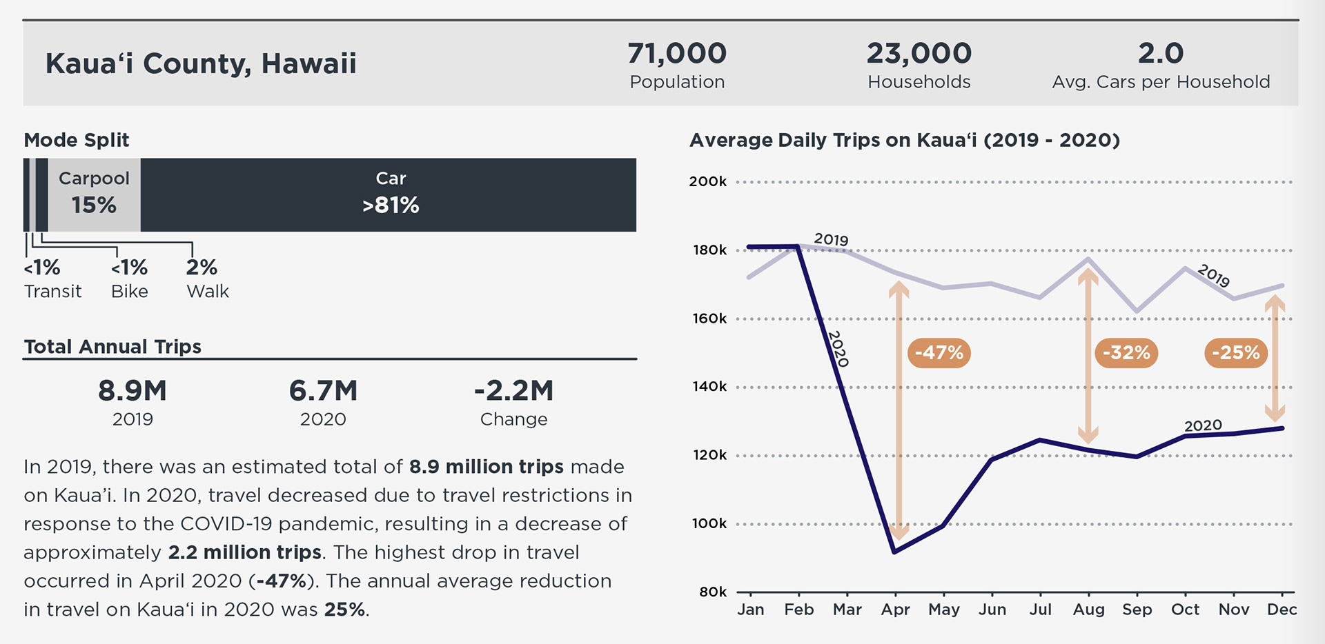
The travel pattern data shows substantial reductions in eating, shopping, social, and recreational trips, and increased proportions of trips to home and work.
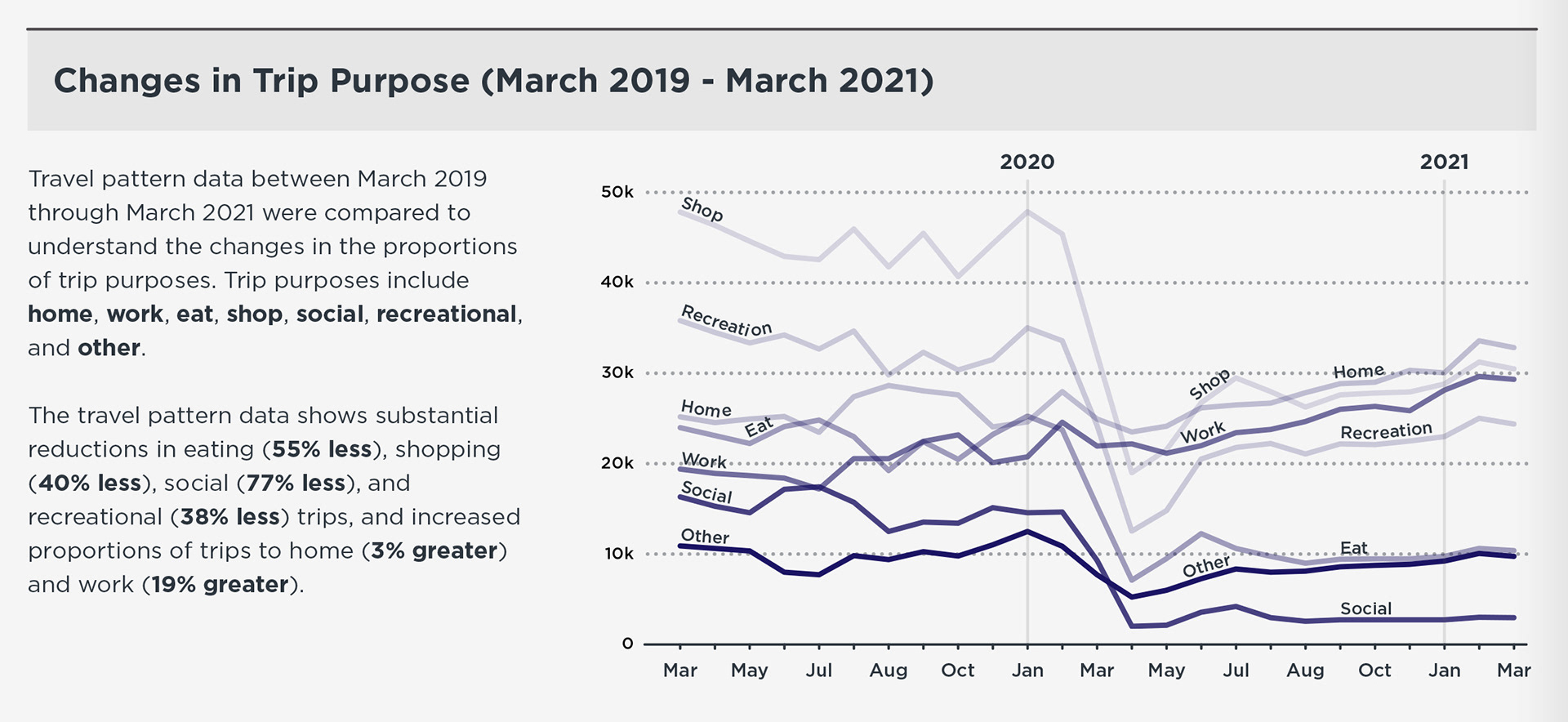
Origin/destination patterns to and from each area are summarized in "rainbow" charts. The rainbow motif and playful colors were inspired by Hawaii's nickname, the "Rainbow State".