Moonlight Outpost: Environmental design inspired by Hong Kong night markets
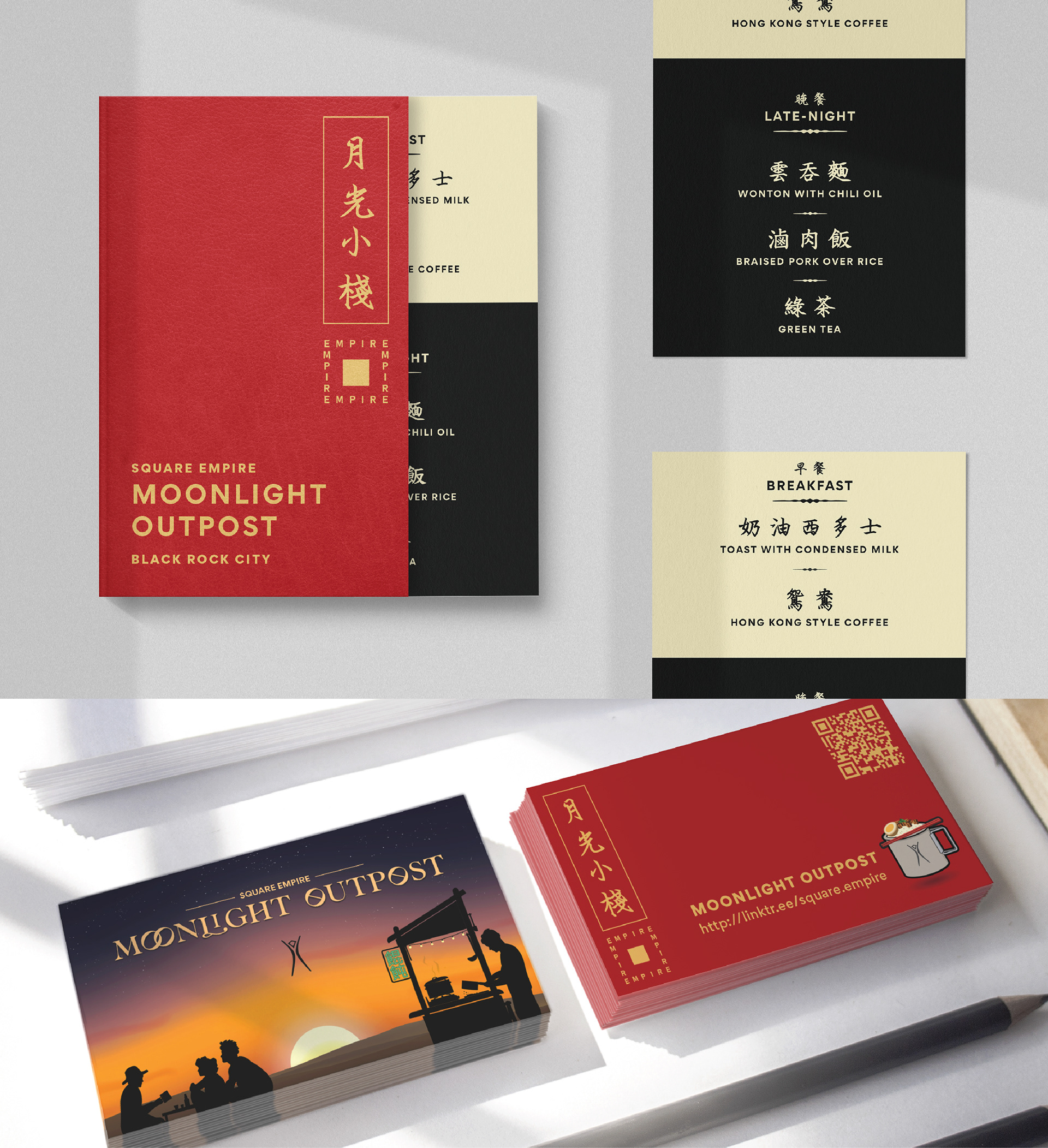
I created a visual identity for a Hong Kong-inspired food stall, drawing from the neon energy of Hong Kong streets and the nostalgic visual language of Chinatown restaurants from the 1970s through the 1990s. The system paired traditional Chinese calligraphy with contemporary typography and extended across menus, stickers, postcards, pendants, business cards, digital graphics, and the physical cart itself.
The project was an experiment in carrying one visual language across print, digital media, and a built environment while keeping the experience cohesive.
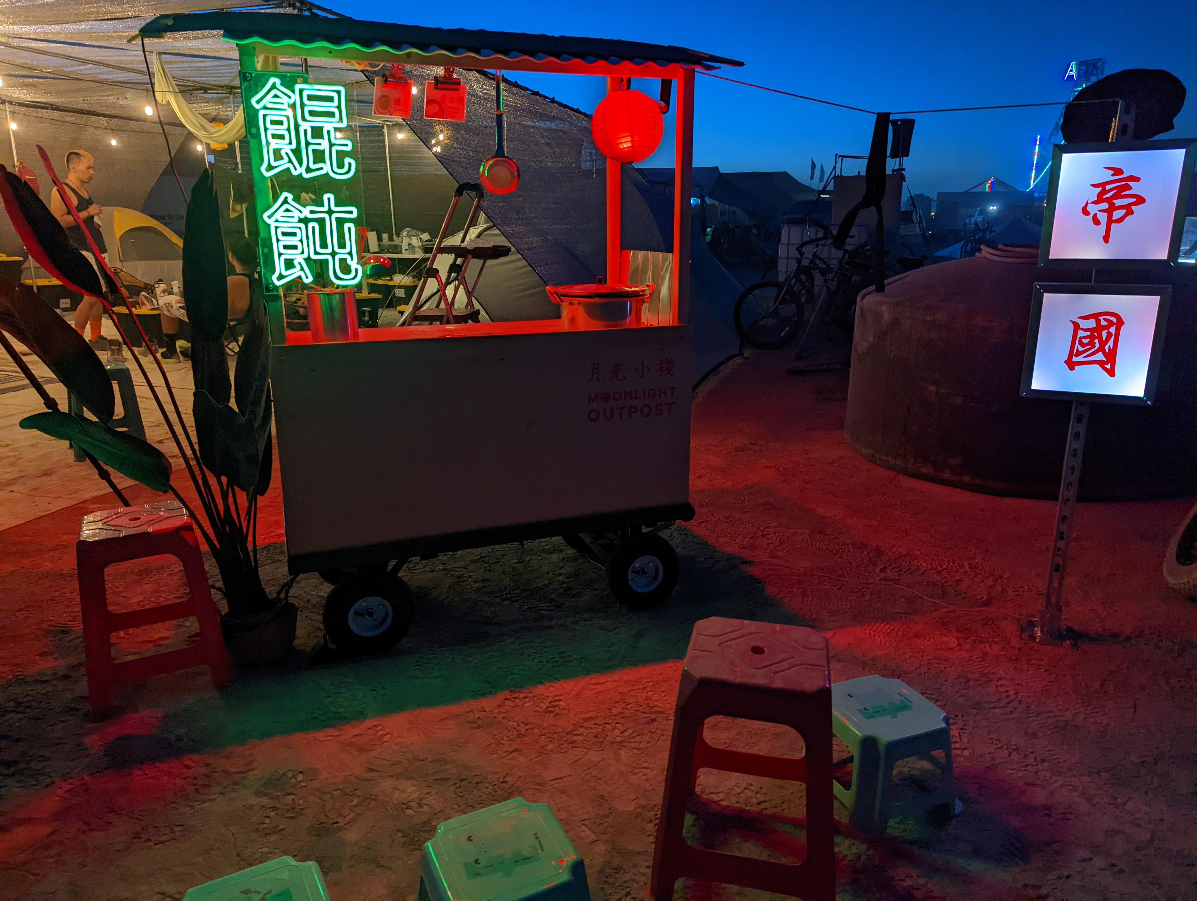
I designed and built every component of the Moonlight Outpost cart, combining custom neon LED lighting, vinyl cutting, woodworking, and graphic fabrication. Each element was designed with outdoor durability in mind, bringing the visual identity to life as an immersive art and dining experience for hundreds of people.
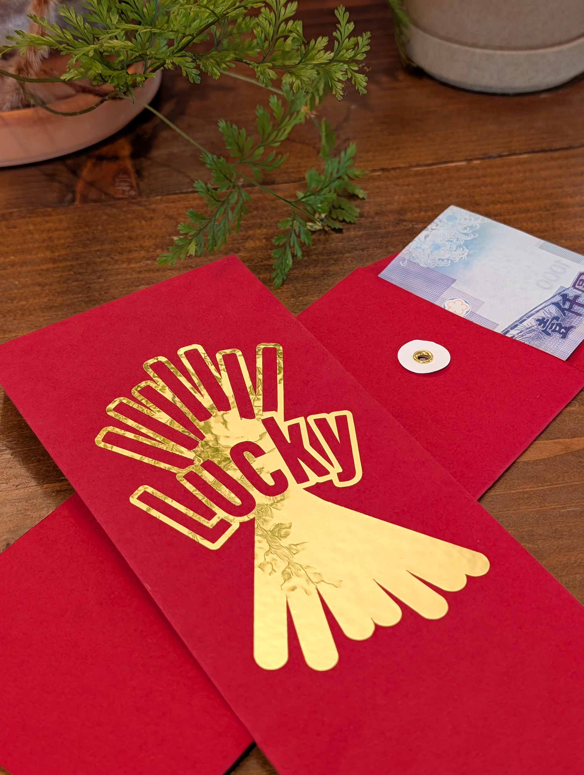
Lucky Envelope: Material Aware Packaging Design
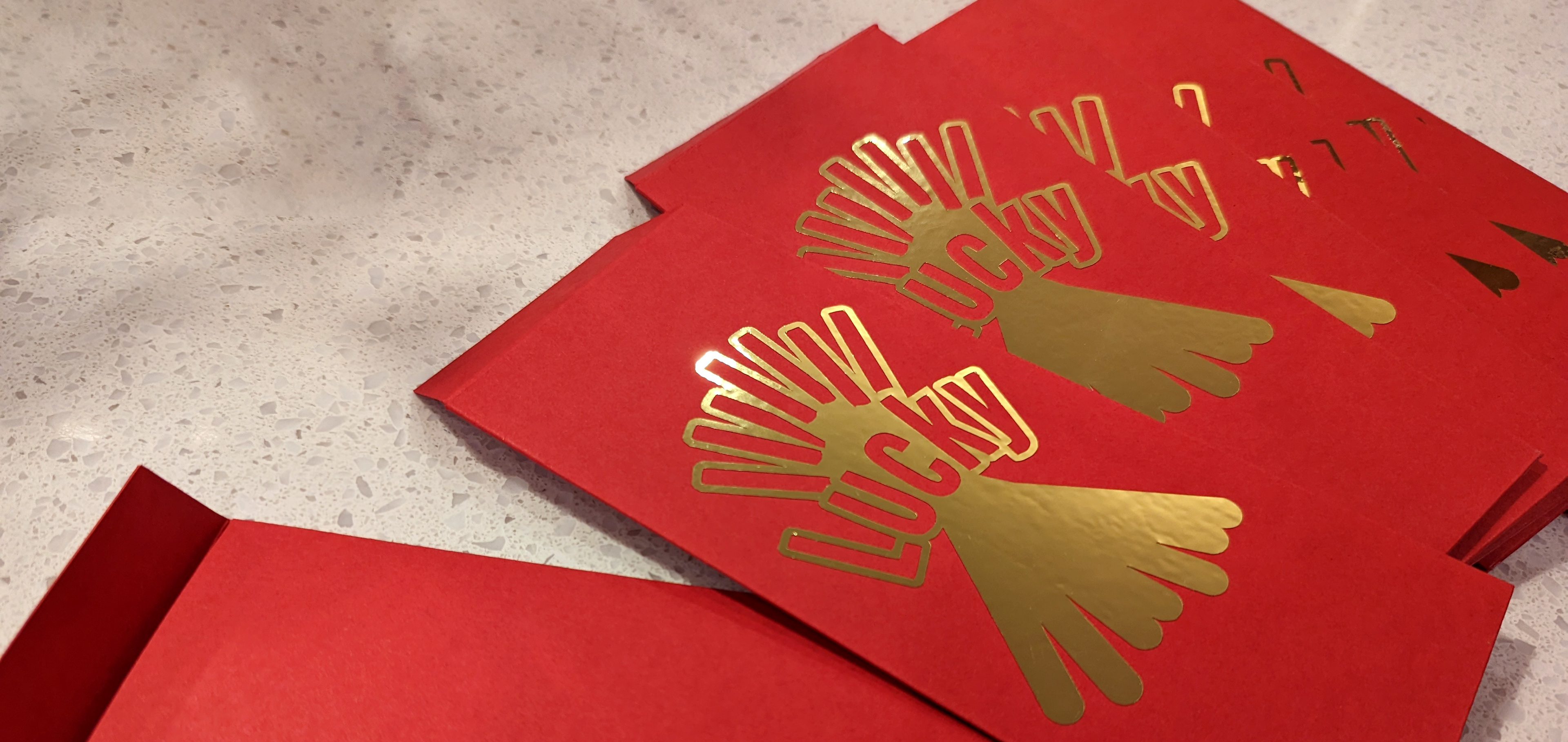
This project is a playful reinterpretation of the Pocky snack, replacing “Pocky” with “Lucky” to create a motif that honors the celebratory Lunar New Year red envelope. Vector artwork was created in Illustrator and optimized for foil vinyl cutting, requiring precise paths and spacing for clean cuts. The envelope structure was custom designed and from red 65lb cover cardstock, chosen for its durability and handling. This project demonstrates how 2D graphics translate onto physical objects. I combine illustration, material selection, and fabrication while accounting for material behavior and production constraints.

Hand drawn concept

Gold foil